A11y Check: Quick accessibility audit of PKP Intercity website – part 2
In the second part of the “A11y Check” accessibility audit of the PKP Intercity website, we focus on comfort of use when navigating with a keyboard or screen reader. We analyse forms, interface interactions, and page title and language settings, examining how they affect the journey planning and ticket purchase flow and where accessibility barriers occur.
16.12.2025
Date of audit
12-16.12.2025
Page/Project
https://www.intercity.pl/pl/
Tools used in the audit
Chrome Browser, Macbook, WAVE, Keyboard Test, Voiceover Reader, DOM Tree Inspection
Conducted by
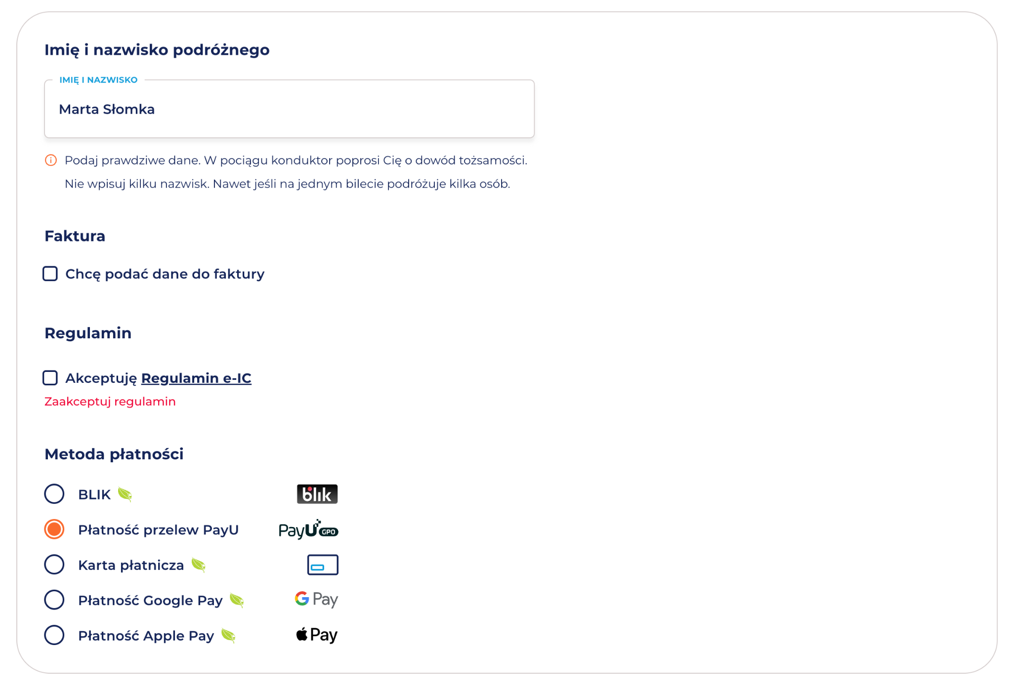
Marta Słomka
Introduction
This publication is divided into two parts and is part of our series of short accessibility audits of public services. In this section, we present findings related to keyboard accessibility, form handling, and page metadata across key steps of the ticket purchase process. Read the first part of PKP Intercity accessibility audit.
In the audit, we checked the four subpages most relevant to the user experience on this portal:
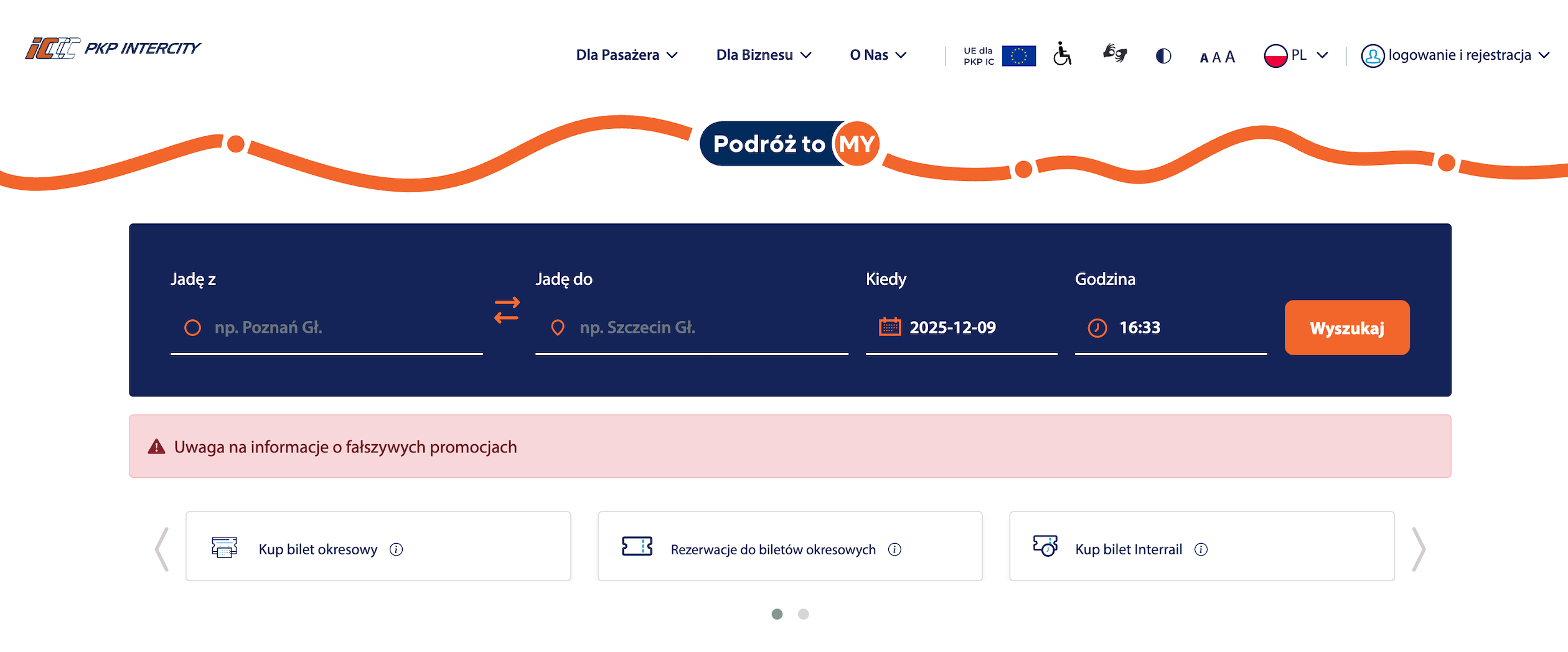
Main page It is a starting point for visitors. It includes a call finder, shortcuts to the most important services, messages for passengers, news and a menu leading to the service section.
Why important: homepage clarity determines whether users understand the site structure and quickly find key content.
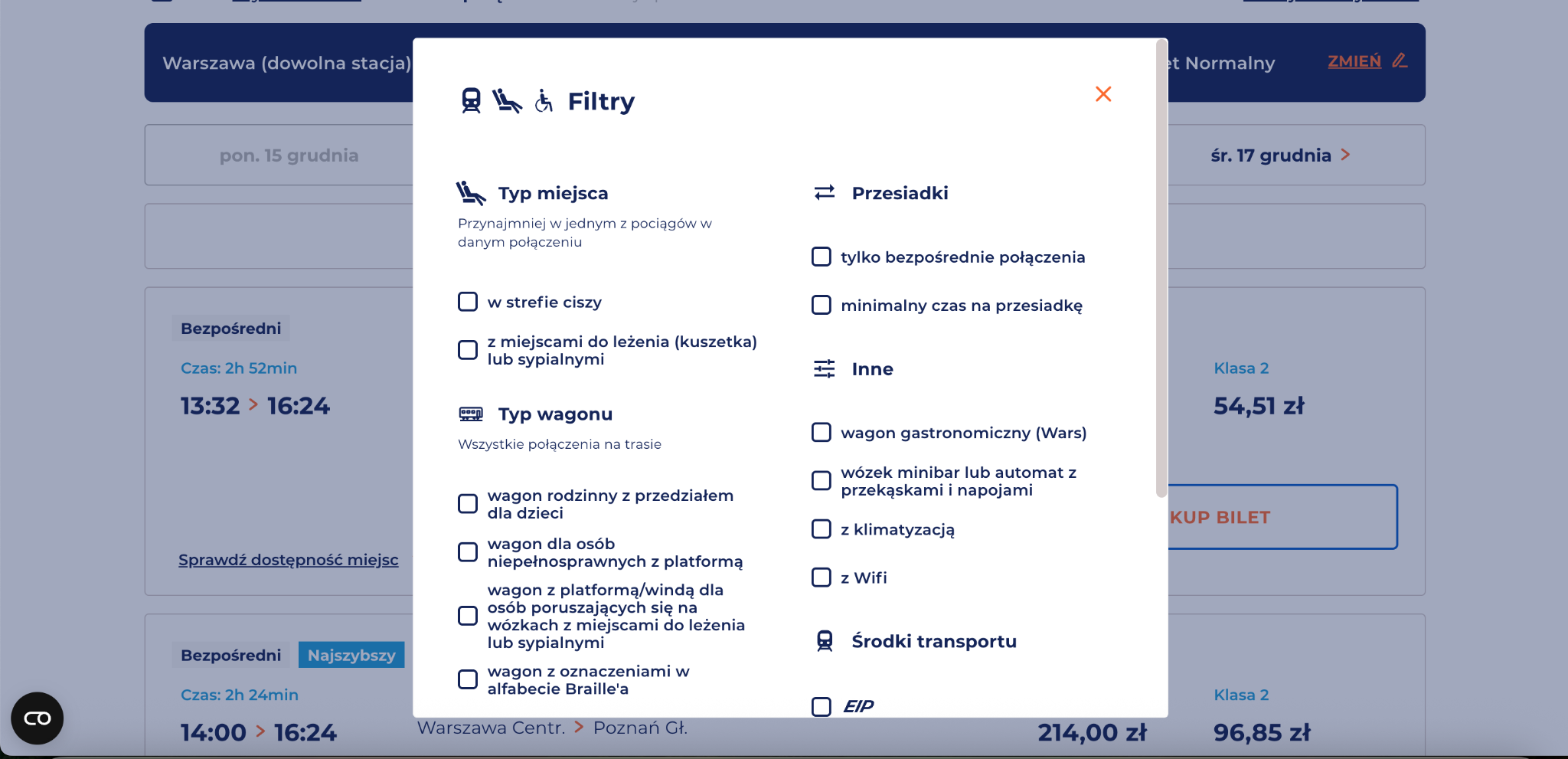
Subpage Connection List – Call Search Results– A view presenting available connections matching selected criteria, allowing users to compare routes, times, transfers, and classes.
Why important: this is the first real decision point in the journey. Accessibility issues at this stage can prevent users from comparing options or continuing the purchase.
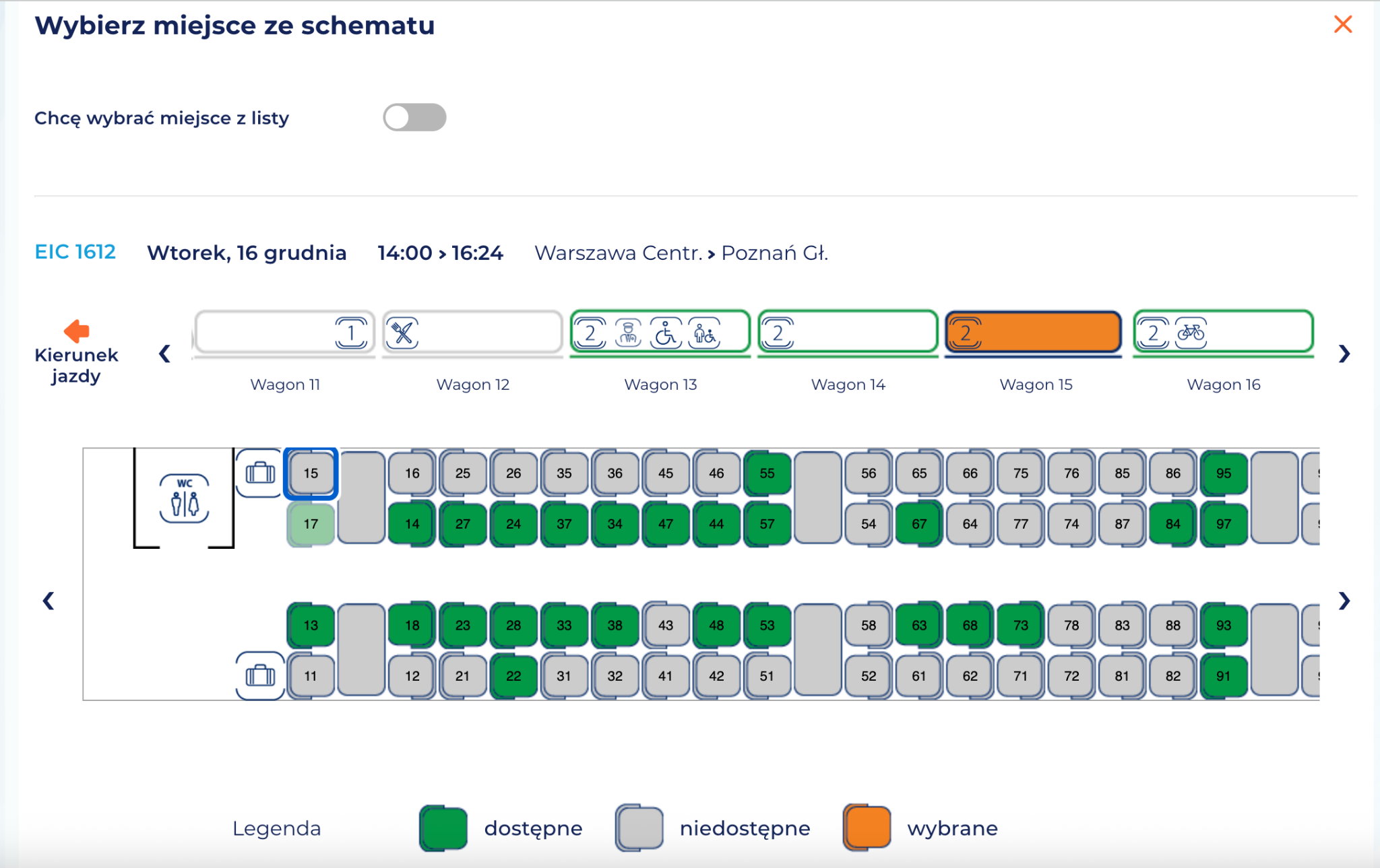
Subpage Your yourney – seat selection – the subpage allows you to select a specific seat in the car or accept automatic allocation; it contains extensive interface components: wagon maps, icons, messages and a selection of additional options.
Why important: unclear labels, missing seat descriptions, or keyboard navigation issues may prevent users from completing the purchase independently.
Subpage Payment – the last stage in which the user confirms the order details and chooses the form of payment.
Why important: is the place that decides the conversion. Errors can block the completion of the purchase.
Research context
The audit was conducted as part of a series of short reviews of websites and applications focused on digital accessibility. Its purpose is to assess the extent to which public-sector services comply with the key WCAG 2.1 AA criteria and the requirements of the Polish Digital Accessibility Act of 2019.
Audit method
The audit was carried out using the Accesscheck quick-assessment method, combining expert review with automated testing. The evaluation covers between 7 and 10 key criteria addressing the most common accessibility issues. The analysis includes up to three or four views – those most frequently used as entry points to the service.
The overall accessibility score is defined on a three-level scale:
Accessible – the website meets most WCAG 2.1 AA requirements. Any non-compliances are minor and do not significantly affect access to content.
Partially accessible – the website meets many requirements but contains notable issues in specific areas (e.g., navigation, forms, multimedia). These problems may limit accessibility for some users.
Not accessible – the website does not meet key WCAG 2.1 AA criteria. Structural, navigation, or interaction issues prevent some users from fully or at all accessing the content.
Note
A full accessibility audit requires evaluating the selected views against 50 success criteria of WCAG 2.1 at levels A and AA, or 55 success criteria of WCAG 2.2 at levels A and AA. The audit is conducted by a digital accessibility specialist with frontend development expertise, which enables precise and technically grounded recommendations for identified issues.
Accessibility audit – score based on chosen criteria
Ocena: NiezgodneRating: Non-compliantOcena: Częściowo zgodneRating: Partially compliantOcena: ZgodneRating: Compliant
Why is this important?
Keyboard accessibility and visible focus are essential for users who do not use a mouse, including people with mobility or visual impairments. All interactive elements must be keyboard-accessible and clearly indicate focus so users can track their position on the page.
What we checked
Whether all links, buttons and form fields can only be operated with the keyboard.
Whether the focus (active element) is always visible when navigating.
Whether the order of passage between elements (tab) is logical and consistent.
Are there no keyboard traps, from which you can not get out without using the mouse.
Findings
Overall, the website is only partially keyboard-accessible – users can reach most elements, but not all of them behave according to expected interaction patterns.
Focus is clearly visible during navigation across the entire site.
The main navigation follows expected keyboard interaction patterns. Dropdown menus can be activated with Enter, moving between submenu items works with the up and down arrow keys, and returning to the first-level navigation is possible using the Escape key. The focus order within the navigation is logical.
For improvement:
The change font size element in the main navigation is skipped during keyboard navigation, which means that the tab user cannot change the font size. <button>This is because the code uses elements <span> instead of a semantic element. Items <span> are not focusable by default and do not support keyboard interaction. Although the aria-label attribute is also used in the code, it is only used to give an accessible name to an element, but it does not make it accessible from the keyboard.
Move the focus to the first position in the submenu after it is expanded – now the focus is shifted, which means that the keyboard user must press Tab additionally.
<button> The station swap button (arrows) receives focus, but does not respond to the keyboard (Enter/Space), since no semantic markup was used in the code.
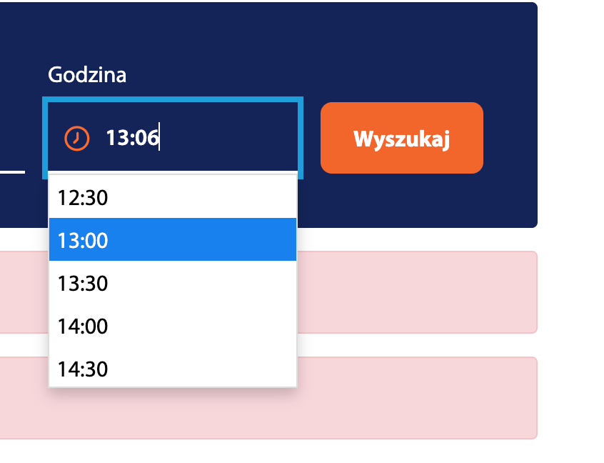
Can't use keyboard to call calendar component nor choose dates from it. Keyboard interaction is limited only to manually typing the date in the text box.
The time checkbox is incorrectly implemented and does not work correctly either from the keyboard or with the mouse – when you try to change the value, the field automatically returns to the current time.
When you open a modal with filters, the focus initially goes inside it, however, it is not trapped in it (no focus trap). After tabbing through all the interactive elements, the focus “escapes” to the content of the page located under the modal, which means that the user must then tab the entire page to return to the component again.
Inaccessible from the keyboard visual selection of seats – the focus when navigating the component behaves unsteadily – it can “disappear” and there is no way to return to the element. It is true that an alternative choice of place from the list is possible, but when entering the visual selection of places on the SVG map using the keyboard, the user falls into the focus trap.
All elements on the form are accessible from the keyboard.
The form has correctly implemented keyboard handling patterns. Checkboxes are selected with the spacebar key, and navigating between options within the radio group is done by using the arrow keys.
6. Form handling
1.3.1 Information and Relationships (A), 3.3.2 Labels or Instructions (A), 4.1.2 Name, Role, Value (A)
Ocena: NiezgodneRating: Non-compliantOcena: Częściowo zgodneRating: Partially compliantOcena: ZgodneRating: Compliant
Why is this important?
Form field labels allow users to understand what data to enter into each field. Thanks to them, the use of forms becomes simpler and more intuitive.
They are especially important for people who use screen readers – this technology reads labels and tells the user what kind of information is required in a given field. The lack of labels means that blind or visually impaired people cannot fill out the form on their own.
Labels should always be visible, regardless of the screen resolution and the content typed in the box.
What we checked
Whether form fields have correctly assigned labels (<label>or ARIA attributes).
Whether screen readers correctly interpret the structure of the form and the relationships between the elements.
Whether each field has a legible and unambiguous label or instruction.
Whether labels are always visible — regardless of screen resolution and typed content.
Whether the required fields are properly marked (, required, aria-required).
Whether field grouping was applied using <fieldset>i<legend>, if warranted.
Whether interactive elements have a specific name, role, and value — through semantic HTML or ARIA tags.
Whether dynamic components (e.g., messages, dialog boxes, tabs) are available to screen readers.
Whether the current state of the elements (e.g. expanded, active, hidden) is correctly transmitted to the assistive technology.
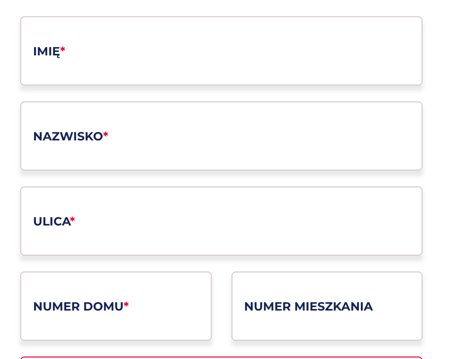
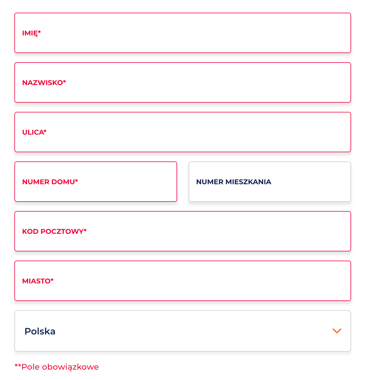
Throughout the form, labels are correctly linked to fields – label for and input id.
Problems:
The instruction under the Traveller's Name field is not linked to the form field. This means that the screen reader will not read this information after entering the field, so the user using the reader may not know that
that real data is required,
that it is not allowed to enter several names.
In addition, this field is mandatory, but neither visually nor in the code it is correctly marked:
None required
No aria-required="true”
There is no text information that the field is mandatory.
The remaining mandatory fields are marked only with an asterisk. No aria-required="true” and/or required for fields marked as mandatory.
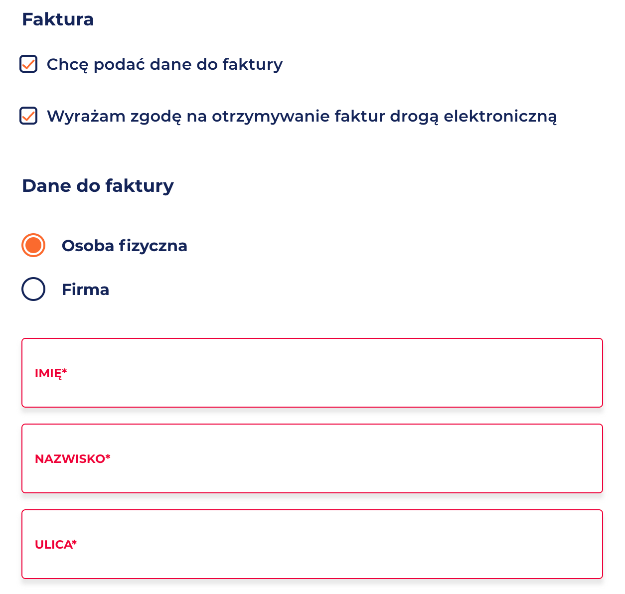
The section “Data to invoice” is dynamically activated after checking the checkbox, but no status change information (aria-expanded, aria-live), and the focus is not shifted to the newly exposed content. Users may not notice that new fields have appeared.
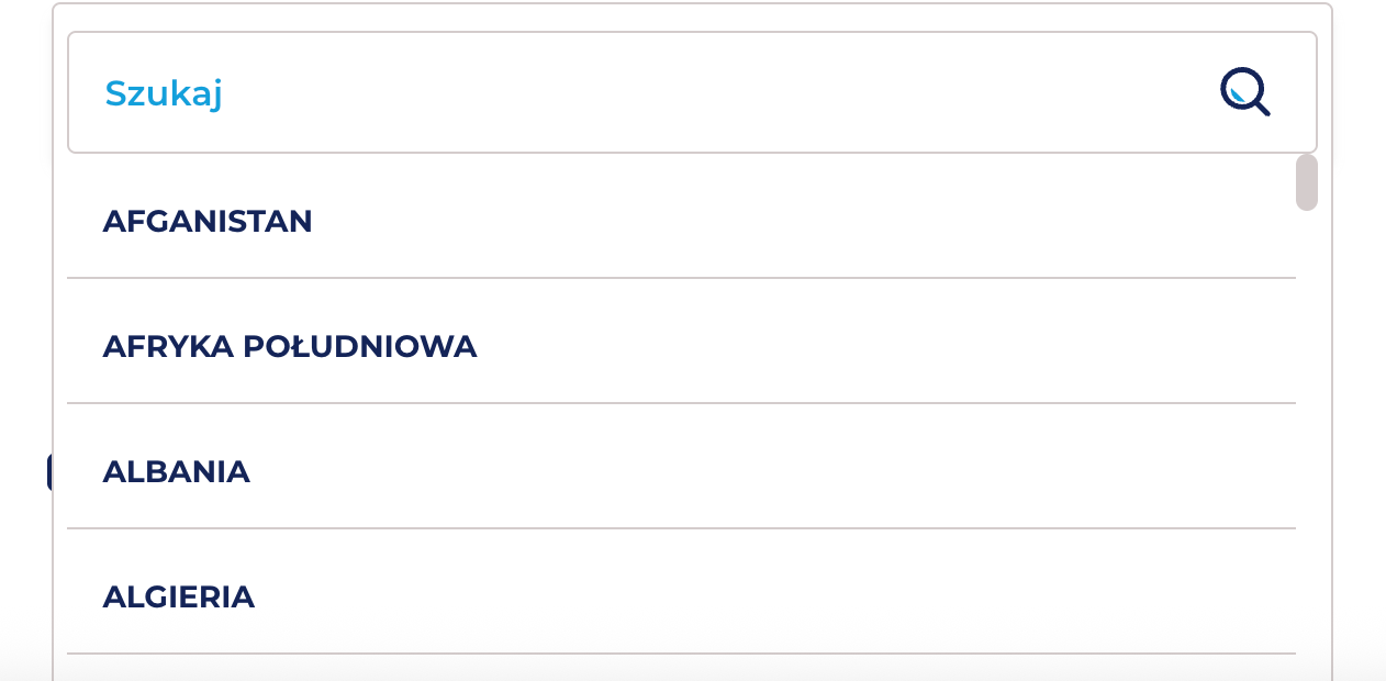
The country selection field is disabled<select disabled>. The keyboard user hits an item with which he can not do anything. Mouse users can click and open the selection.
Radio buttons have labels, but the group lacks a heading. The options “Individual” and “Company” are not wrapped in a <fieldset> with a <legend>, which is required so screen readers can understand the context of the choice and recognise the group semantically
Error messages:
No visible error messages.
The error is indicated only by color – the only indicator of error is a red frame, without a text message explaining what needs to be corrected. This means:
the user does not know, what exactly is incorrect,
the error message is not programmatically related to the field,
the screen reader will not receive any error information.
7. Title of the page and language of the page
2.4.2 Title of page (A), 3.1.1 Language of page (A), 3.1.2 Language of part (AA)
Ocena: NiezgodneRating: Non-compliantOcena: Częściowo zgodneRating: Partially compliantOcena: ZgodneRating: Compliant
Why is this important?
The title of the page informs users about the content and purpose of the page, as well as helps them to orient themselves when browsing multiple tabs. It is visible in the browser bar, in search results and in the history of visited pages. For people who use screen readers, the title is of particular importance – it is the first information they hear when they enter the site. The title also affects the positioning in search engines. It should be unique to each subpage and include key information such as the subpage name and site name.
The correct designation of the language of the page (lang attribute) allows screen readers to correctly read the content in the appropriate language and tone of voice.
The absence or mislabeling of the language makes it difficult to understand the content, especially on multilingual sites. Each page should have a primary language set, and fragments in other languages should have a local designation (lang="en”, lang="de”).
What we checked
Whether the subpages of the site have a title describing their purpose or topic.
<html lang="pl">Is the main document language set in the page code ()
Findings
Language of the site
Each of the audited pages has a properly defined language of the document,
Title of the page
The checked subpages have imprecisely defined titles because they do not clearly describe the content, e.g.:
Main page <title>Buy a ticket - PKP Intercity</title> The title is formally correct and contains the name of the site, however it does not fully reflect the nature of the homepage.
Search results <title>E-ic2 - Online reservation</title> The title is too general and does not inform about the current stage of the process. It does not indicate that the user is in the list of search results.
Payment subpage <title>E-ic2 - Online reservation</title> The title is identical to the previous stage of the process. The user does not receive information that he is at the stage of payment.
Summary
Overall accessibility assessment
Rating: The website is partially accessible
The PKP Intercity website meets only part of the accessibility requirements within the journey planning and ticket purchase flow. While many components show accessibility-aware design, inconsistencies in implementation create significant barriers for keyboard and screen reader users, preventing full access at all stages.
What works well
Correctly applied alternative texts for graphic elements.
Provided alternative way to select seats through the list, which partially compensates for the inaccessibility of the visual map of the wagon.
The timer at the payment stage has been correctly marked with the aria-live attribute, so that users of screen readers are informed about the passage of time.
The main navigation of the homepage is keyboard-operated according to the accepted interaction patterns.
The most important problems to repair
Keyboard operation:
Not all interactive elements can be operated from the keyboard (e.g. element-based buttons, <span>date and time selection, visual location selection).
There are traps of focus in modals.
Focus does not always shift to newly opened or dynamically displayed content.
Forms and error messages:
Text error messages are missing.
Mandatory fields are not consistently marked in the code (required, aria-required).
Field instructions and dynamically displayed sections (e.g. invoice data) are not communicated to keyboard and screen reader users.


