A11y Check: Quick accessibility audit of the PKP Intercity website – part 1
The PKP Intercity website is a key place where passengers plan their journeys, so its accessibility has a real impact on users. As part of our “A11y Check” series, we examined the essential steps leading to ticket purchase. This is the first part of a quick audit assessing how accessible the service is for everyone.
9.12.2025
Date of audit
05-09.12.2025
Page/Project
https://www.intercity.pl/pl/
Tools used in the audit
Chrome browser, MacBook, WAVE, keyboard testing, VoiceOver screen reader, DOM tree inspection
Conducted by
Marta Słomka
Introduction
In this quick audit, we examined the accessibility of the PKP Intercity website, focusing on the pages that make up the journey planning and ticket-purchase flow. The publication is split into two parts and is part of our ongoing series of short audits of public websites and online services.
The PKP Intercity website is the primary place where passengers check timetables, search for connections, and buy tickets. It is used intensively every day, which means its accessibility directly affects whether everyone – regardless of limitations – can plan and pay for their trip independently.
In this audit, we evaluated four pages that are crucial to the user experience on this public service portal:
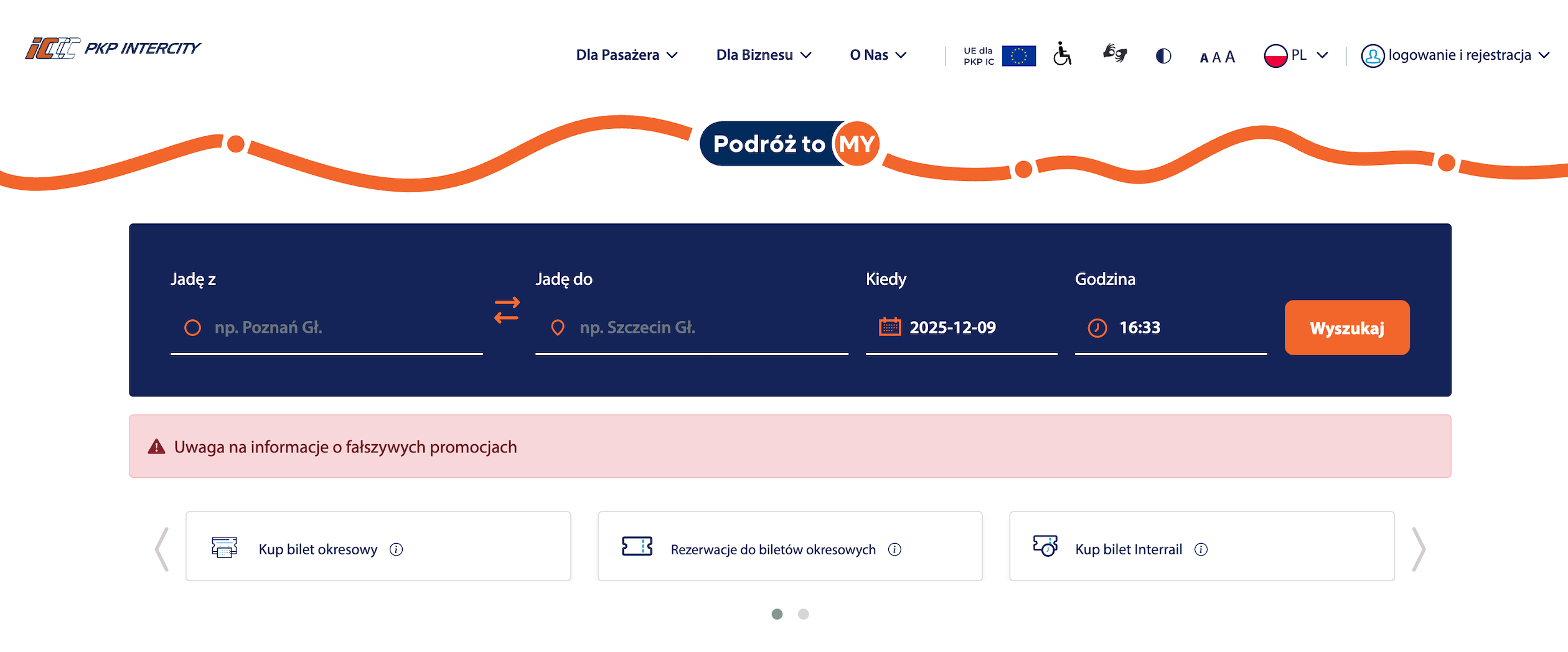
Homepage – the starting point for visitors. It includes the connection search engine, shortcuts to key services, passenger announcements, news, and navigation to other sections.
Why it matters: the clarity and structure of the homepage determine whether users can quickly understand the website and find what they need.
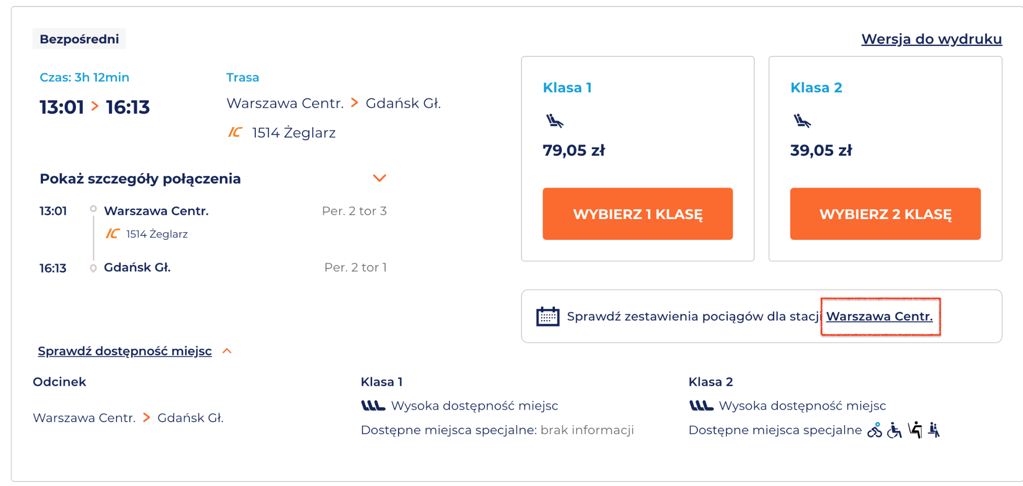
Connections List – Search Result – a view showing available train connections that match the user’s criteria. Here, the user selects the most suitable route and checks times, transfers, and available classes.
Why it matters: this is the first stage where real travel decisions are made. Accessibility barriers here may prevent users from comparing options or continuing the purchase.
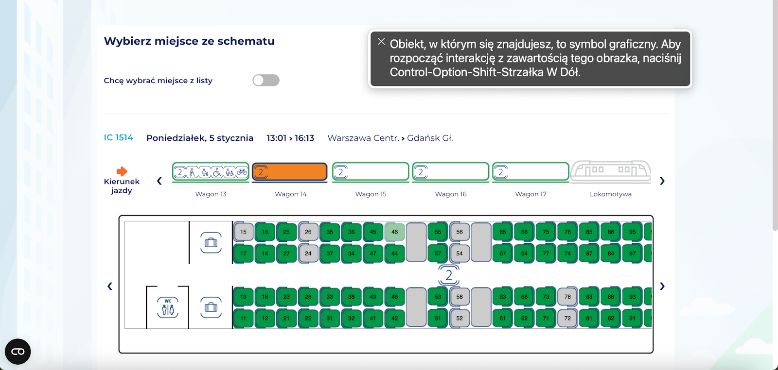
Your Journey – Seat Selection – a page where users choose specific seats or accept automatic assignment. It contains complex interface components such as wagon maps, icons, messages, and add-on options.
Why it matters: unclear labels, missing seat descriptions, or lack of keyboard operability may prevent users from completing the purchase independently.
Payment – the final step where users confirm order details and select a payment method.
Why it matters: this step determines conversion. Accessibility issues here can block the completion of the transaction.
Research context
The audit was conducted as part of a series of short reviews of websites and applications focused on digital accessibility. Its purpose is to assess the extent to which public-sector services comply with the key WCAG 2.1 AA criteria and the requirements of the Polish Digital Accessibility Act of 2019.
Audit method
The audit was carried out using the Accesscheck quick-assessment method, combining expert review with automated testing. The evaluation covers between 7 and 10 key criteria addressing the most common accessibility issues. The analysis includes up to three or four views – those most frequently used as entry points to the service.
The overall accessibility score is defined on a three-level scale:
Accessible – the website meets most WCAG 2.1 AA requirements. Any non-compliances are minor and do not significantly affect access to content.
Partially accessible – the website meets many requirements but contains notable issues in specific areas (e.g., navigation, forms, multimedia). These problems may limit accessibility for some users.
Not accessible – the website does not meet key WCAG 2.1 AA criteria. Structural, navigation, or interaction issues prevent some users from fully or at all accessing the content.
Note
A full accessibility audit requires evaluating the selected views against 50 success criteria of WCAG 2.1 at levels A and AA, or 55 success criteria of WCAG 2.2 at levels A and AA. The audit is conducted by a digital accessibility specialist with frontend development expertise, which enables precise and technically grounded recommendations for identified issues.
Accessibility audit – score based on chosen criteria
1. Text alternatives for non-text content
1.1.1 Non-text Content
Ocena: NiezgodneRating: Non-compliantOcena: Częściowo zgodneRating: Partially compliantOcena: ZgodneRating: Compliant
Why it matters
Text alternatives (descriptions of images and other non-text content) allow all users to understand what appears on a page, including people who are blind or have low vision. They enable screen readers to describe the content of an image. They are also useful when an image fails to load because of an error or a weak internet connection. In addition, they help search engines index images by recognising their content and linking them to the topic of the page, which can improve visibility in search results.
A good text alternative should be short, simple, and explain what the image shows or what its purpose is. It should not repeat information already provided in nearby text. If an image is decorative and adds no meaning, it should be hidden from screen readers.
What we checked
Whether images, photos, charts, maps, infographics, and decorative graphics include correct text alternatives (alt attribute).
Whether graphic buttons and links have descriptions that clearly state their function or purpose.
Whether form fields are properly labelled so users know what information to enter. Whether CAPTCHA elements provide an alternative verification method (e.g., audio).
Findings
Homepage, navigation, and footer
Issues:
Logos used as links do not have descriptive alt attributes, which means that for assistive technology users they may be announced simply as “link, graphic.” As a result, the user receives no information about which institution the logo represents or where the link leads (e.g., to the Public Information Bulletin or EU project pages).
In the current code, the images use an empty alt attribute, while the purpose of the link is provided only in the title attribute. This is problematic because many screen readers do not announce title, and on mobile devices this attribute is not accessible at all.
Pros:
Decorative icons use empty alt attributes, allowing screen readers to skip them.
Most images on the site include appropriate alternative text.
Icons for train classes and types (EIP, IC, TLK) – the icons for EIP, IC, and TLK are correctly configured with:
role="img"
aria-label="Express InterCity Premium", itp.
“Reservation required” icon – the code is properly labeled, which allows users to understand the meaning of the “R” symbol::
aria-label="Reservation required"
Thanks to the aria-label, assistive technologies such as screen readers can announce the meaning of the graphic symbol.
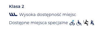
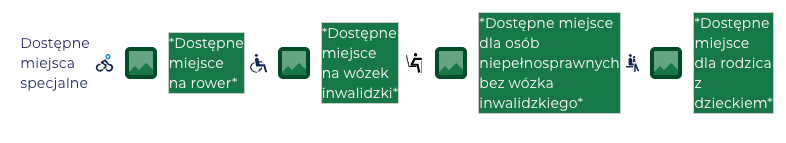
Graphic markers for special seats (e.g., bicycle space, wheelchair space, etc.) are correctly described in the code. Each icon includes an alt attribute, and the descriptions refer to the function represented by the image rather than its appearance.
the icons include properly prepared alternative descriptions,
decorative images are correctly assigned alt="" or aria-hidden,
the labels of buttons and links are supplemented with aria attributes, giving screen reader users clearer context about each element’s action.
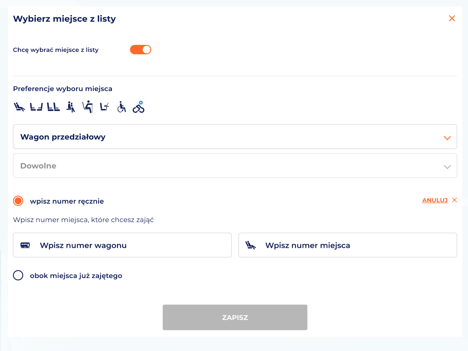
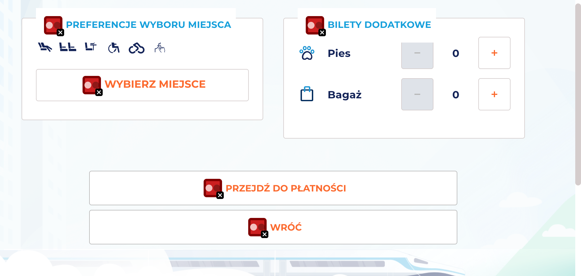
Alternative seat selection method
The PKP website includes a complex, visual seat selector presented as a wagon map. It is not fully operable with a keyboard or screen readers; however, an alternative seat selection method is provided – through an accessible list.
The countdown timer for completing the ticket purchase is marked with aria-live, ensuring that screen reader users are continuously informed about the remaining time to finish the transaction.
Issues
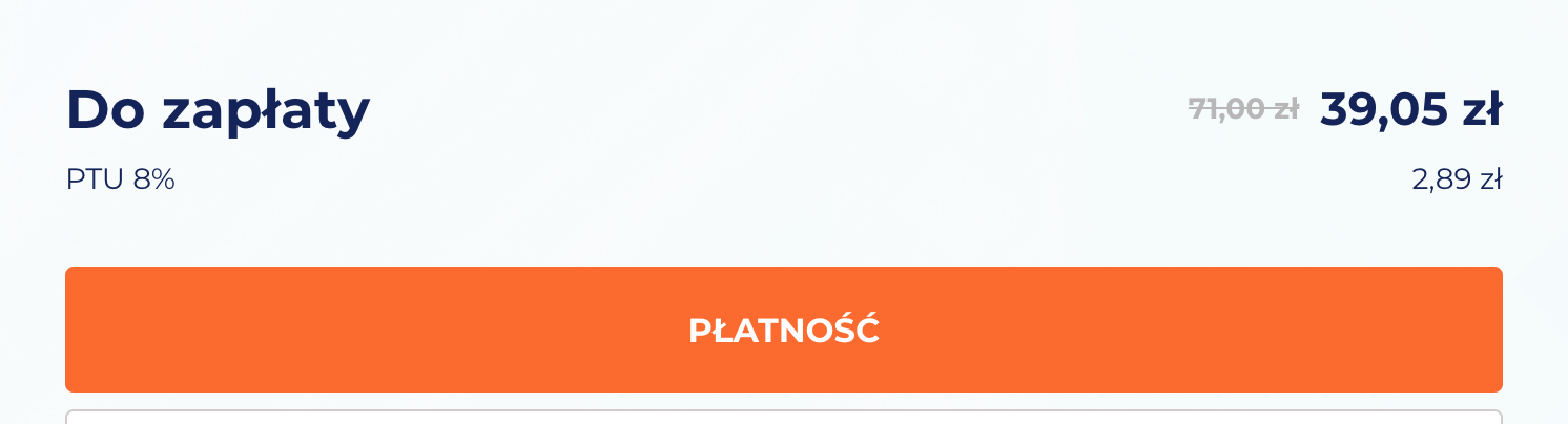
Screen reader users cannot tell what the ticket price was before the discount. The crossed-out price of 71.00 zł is conveyed visually only – no aria attributes or hidden descriptions are used to indicate that this is the previous price and that 39.05 zł is the current one. The screen reader announces: “Amount due: 71 zł, current price 39.05 zł,” which misrepresents the information.
2. Heading structure
1.3.1 Info and Relationships (A), 2.4.6 Headings and Labels (AA)
Ocena: NiezgodneRating: Non-compliantOcena: Częściowo zgodneRating: Partially compliantOcena: ZgodneRating: Compliant
Why it matters
Headings organise content and help users quickly understand the structure of a page. They make it easier to find information and see how sections relate to each other.
They are also essential for accessibility – screen readers use headings to navigate, and users with dyslexia or older adults can follow the content more easily.
A clear heading hierarchy also supports search engine visibility.
What we checked
Whether headings on the page follow a logical and consistent hierarchy (H1–H6).
Findings
Homepage
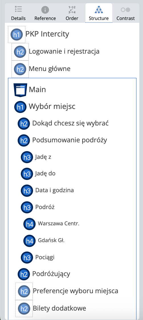
The heading structure is missing an <h1>, which should define the main title of the page.
<h3> headings in the connection search section are incorrectly nested – there are no higher-level headings above them, which disrupts the document hierarchy.
The remaining <h2> and <h3> headings are used correctly and follow an appropriate order.
Other subpages
Issues:
On the analyzed subpages, the top bar contains hidden headings (h1, h2). This is an error, because according to semantic best practices and WCAG guidelines, headings should describe the structure of the page’s content, not navigation elements or menu icons.
As a result, two <h1> headings appear on the Your Journey – Seat Selection page:
h1: "PKP Intercity" – a hidden heading in the top menu,
h1: "Seat selection" – the proper heading for the main content section.
3. Text contrast
1.4.3 Contrast (Minimum) (AA)
Ocena: NiezgodneRating: Non-compliantOcena: Częściowo zgodneRating: Partially compliantOcena: ZgodneRating: Compliant
Why it matters
Sufficient contrast between text and background makes content easier to read for all users, not only for those with visual impairments. Low contrast makes text difficult to read, especially in poor lighting or on lower-quality screens.
The contrast ratio defines the difference in luminance between text and its background. For normal text, it should be at least 4.5:1, and for large text and headings 3:1.
What we checked
Whether text and text-based graphics meet the minimum contrast ratio of 4.5:1.
For large text: 3:1.
Findings
Issue:
Key elements in the PKP Intercity design system have insufficient contrast, which leads to systematic, recurring accessibility issues across many pages and affects the readability of the interface.
CTA buttons (e.g., “Select seat,” “Proceed to payment,” “Back,” “Search”) – both the filled and outlined variants have insufficient contrast between text and background
Orange link and action text (e.g., “Later,” “Back to search results”)
Orange labels and markers on light backgrounds (e.g., numbers, badges, highlights)
4. Link clarity
2.4.4 Link Purpose (In Context) (A)
Ocena: NiezgodneRating: Non-compliantOcena: Częściowo zgodneRating: Partially compliantOcena: ZgodneRating: Compliant
Why it matters
Links must clearly communicate where they lead and what happens after activation. This helps users navigate the website and quickly find needed information.
For people using screen readers, link clarity is especially important – many of them hear only the link text, without surrounding context. Phrases such as “read more”, “click here”, or “see” are not descriptive enough.
Clear link text also improves SEO by helping search engines understand page structure and content.
What we checked
Whether link text clearly communicates the destination or action.
Whether links avoid vague phrases such as “read more”, “click here”, or “download” without added context.
Whether contextual descriptions are provided when links appear in lists or longer sentences.
Findings
Homepage
Logo – link to the homepage The logo does not include a descriptive alt="PKP Intercity" attribute, nor does it clearly indicate its purpose — that it links to the homepage. This information could be provided via an aria-label.
Apart from this, the homepage does not contain accessibility issues related to link purpose.