A11y Check: Quick accessibility audit of the mObywatel website – part 2

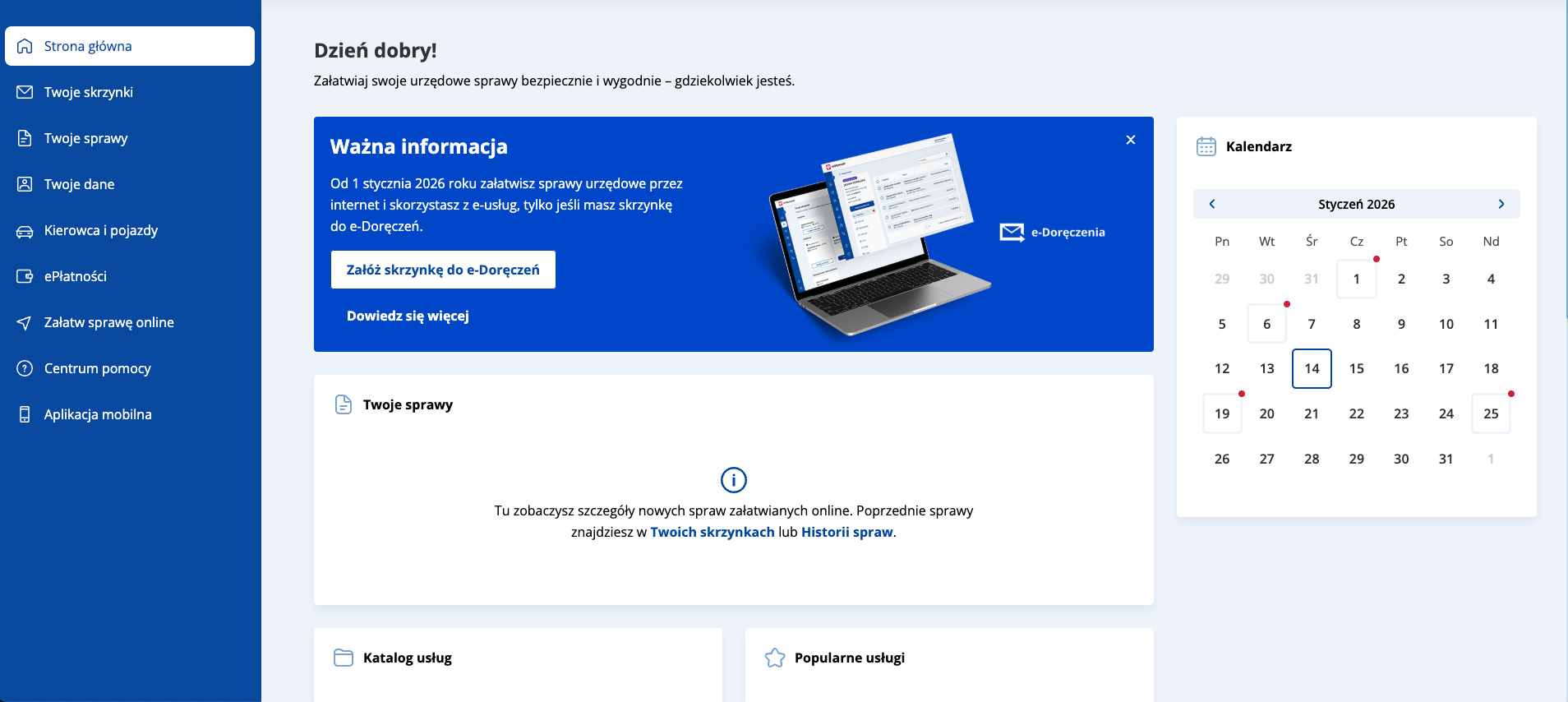
In the second part of “quick accessibility audit for mObywatel, we focus on keyboard support and forms. We review, among others, the user dashboard and, as a form example, we selected the e-Deliveries mailbox setup flow – checking whether the entire process can be completed without frustration and where obstacles appear.

3.2.2026
Date of audit
14-29.01.2026
Page/Project
https://www.mobywatel.gov.pl/
Tools used in the audit
Chrome browser, MacBook, WAVE, keyboard testing, VoiceOver screen reader, DOM tree inspection
Conducted by
Marta Słomka

Wstęp

In the second part of our quick accessibility audit of the mObywatel service in the “A11y checked” series, we look at the elements that, in practice, determine how comfortable it is to use the service without a mouse: keyboard navigation, focus visibility, and form accessibility – using the e-Deliveries mailbox setup process as a sample. We check whether the interface guides users consistently through each step and where barriers appear that may make it harder to complete the journey.

Read part 1 of the mObywatel accessibility audit.

In this audit, we analyzed three pages:

  • Path from the homepage to logging in to the service – we checked whether it is easy to reach the login and whether the choice of authentication method is clear. We tested a commonly used flow: logging in via the Trusted Profile (Profil Zaufany).
    Why it matters: without a successful login, users have no access to any service features.
  • Dashboard – the first view users see after signing in. Users can see available features, documents, and services.
    Why it matters: the clarity of this view determines whether users can quickly find what they need and understand what the service offers.
  • e-Deliveries mailbox setup form – from 1 January 2026, using many e-services will only be possible after setting up an e-Deliveries mailbox.Why it matters: since this is a primary channel for contacting public administration, the form must be fully accessible to all users.

Research context

The audit was conducted as part of a series of short reviews of websites and applications focused on digital accessibility. Its purpose is to assess the extent to which public-sector services comply with the key WCAG 2.1 AA criteria and the requirements of the Polish Digital Accessibility Act of 2019.

Audit method

The audit was carried out using the Accesscheck quick-assessment method, combining expert review with automated testing. The evaluation covers between 7 and 10 key criteria addressing the most common accessibility issues. The analysis includes up to three or four views – those most frequently used as entry points to the service.

The overall accessibility score is defined on a three-level scale:

  • Accessible – the website meets most WCAG 2.1 AA requirements. Any non-compliances are minor and do not significantly affect access to content.
  • Partially accessible – the website meets many requirements but contains notable issues in specific areas (e.g., navigation, forms, multimedia). These problems may limit accessibility for some users.
  • Not accessible – the website does not meet key WCAG 2.1 AA criteria. Structural, navigation, or interaction issues prevent some users from fully or at all accessing the content.

Note

A full accessibility audit requires evaluating the selected views against 50 success criteria of WCAG 2.1 at levels A and AA, or 55 success criteria of WCAG 2.2 at levels A and AA.

The audit is conducted by a digital accessibility specialist with frontend development expertise, which enables precise and technically grounded recommendations for identified issues.

Accessibility audit – score based on chosen criteria

5. Keyboard operation and focus visibility

2.1.1 Keyboard (A), 2.1.2 No Keyboard Trap (A),, 2.4.7 Focus Visibility (AA)

Ocena: Niezgodne Rating: Non-compliant Ocena: Częściowo zgodne Rating: Partially compliant Ocena: Zgodne Rating: Compliant

Dlaczego to ważne

Możliwość obsługi strony za pomocą klawiatury i widoczny fokus są kluczowe dla osób, które nie korzystają z myszy – np. z powodu preferencji osobistych, ograniczeń ruchowych lub problemów ze wzrokiem. Każdy element interaktywny (link, przycisk, pole formularza) powinien być dostępny z klawiatury, a aktualnie wybrany element musi być wyraźnie zaznaczony. Na ogół jest on wyróżniony poprzez ramkę oraz zmianę koloru. Dzięki temu użytkownik wie, na jakim elemencie się znajduje.

Why is this important?

Keyboard accessibility and visible focus are essential for users who do not use a mouse, including people with mobility or visual impairments. All interactive elements must be keyboard-accessible and clearly indicate focus so users can track their position on the page.

What we checked

  • Whether all links, buttons and form fields can only be operated with the keyboard.
  • Whether the focus (active element) is always visible when navigating.
  • Whether the order of passage between elements (tab) is logical and consistent.
  • Are there no keyboard traps, from which you can not get out without using the mouse.

Findings

The path to the mObywatel service and the reviewed pages are keyboard-accessible—users can move through most elements, and their behavior largely follows common interaction patterns. Focus is clear and consistently visible across all tested views.
On the reviewed pages, all clickable elements are reachable via keyboard. The focus order is generally correct, with one exception described below.

Homepage

Strengths:

  • The main navigation relies on native elements (buttons and 
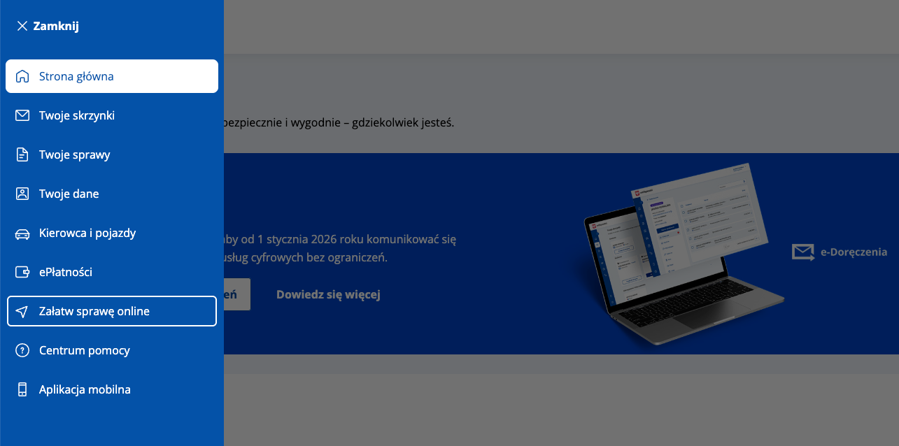
<a> links) within a <nav>, supporting predictable keyboard operation.
    The menu button has a properly defined relationship with the navigation panel (aria-controls="gov-menu", id="gov-menu") and communicates expanded/collapsed state (aria-expanded).

To improve:

  • Focus order – cookie banner

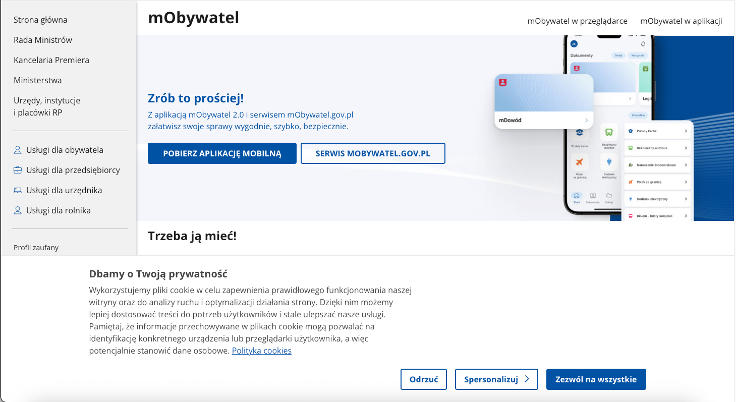
The cookie banner appears at the bottom of the page and does not block the content. Users can scroll and use links without closing it, so a focus trap is not required here. Focus trapping is used when a component behaves like a modal and needs to keep users within one interface area – so focus cannot move with Tab to content underneath until the user closes the dialog or completes the required action.

However, the issue is the order of elements in the HTML. The banner is located at the end of the document and is displayed at the bottom of the page, which means a keyboard user reaches it only after tabbing through:

  • “Skip to section” links,
  • navigation,
  • main content,
  • footer.As a result, users may start using the service without making an informed privacy choice.

Possible solutions:

  • Move focus to the banner when it appears (while allowing easy dismissal and returning the user to where they were),
  • Place the banner higher in the HTML structure so it appears earlier in the tab order.
Dashboard

Notes

On the dashboard subpage, the side navigation is implemented differently than on the service entry page – as an ARIA menu component (role="menu" and role="menuitem"). In practice, users can move between items only with Tab, without Up/Down arrow-key support expected by the WAI-ARIA menu pattern. As a result, the declared ARIA roles do not match the component’s actual behavior, which constitutes a violation of WCAG 4.1.2 Name, Role, Value.

6. Form handling

1.3.1 Information and Relationships (A), 3.3.2 Labels or Instructions (A), 4.1.2 Name, Role, Value (A)

Ocena: Niezgodne Rating: Non-compliant Ocena: Częściowo zgodne Rating: Partially compliant Ocena: Zgodne Rating: Compliant

Why is this important?

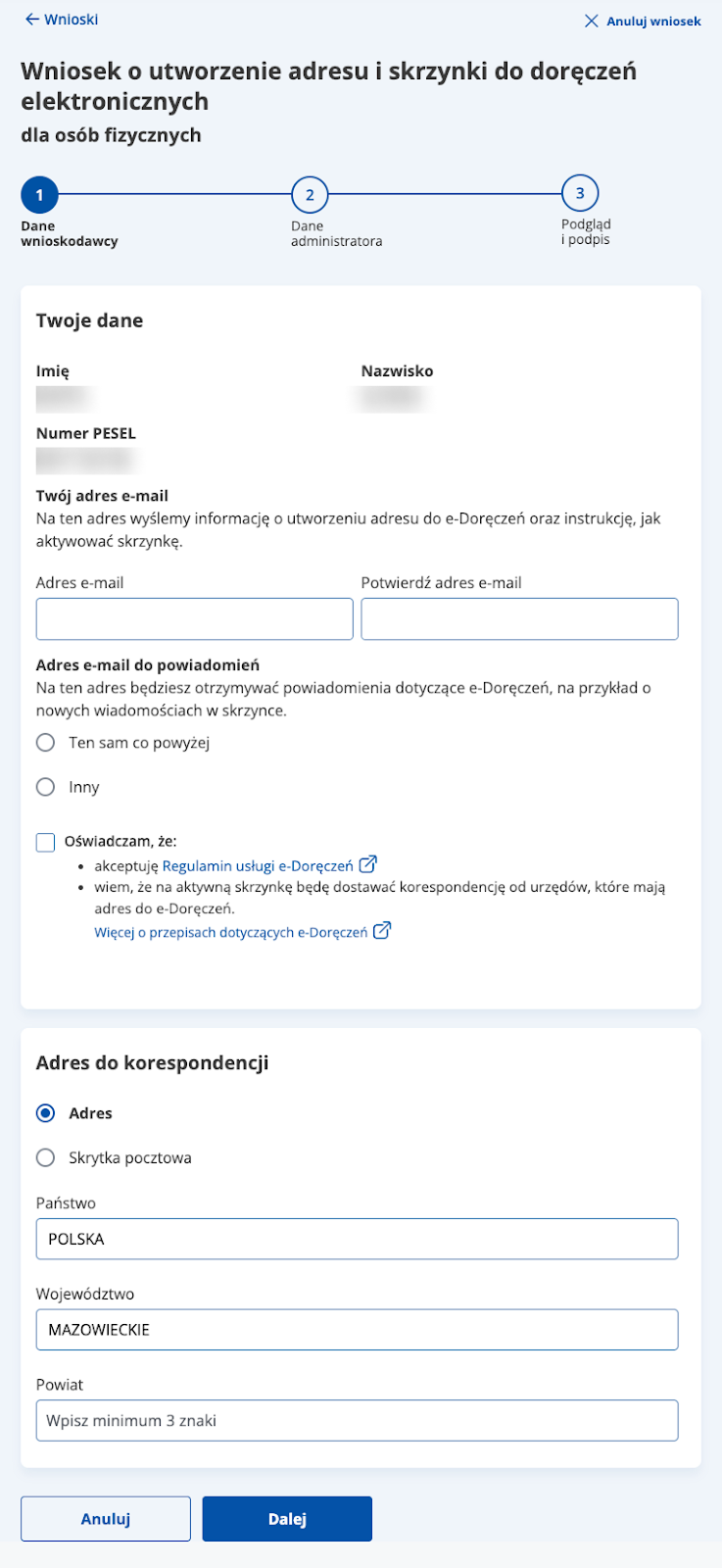
Form field labels allow users to understand what data to enter into each field. Thanks to them, the use of forms becomes simpler and more intuitive.

They are especially important for people who use screen readers – this technology reads labels and tells the user what kind of information is required in a given field. The lack of labels means that blind or visually impaired people cannot fill out the form on their own.

Labels should always be visible, regardless of the screen resolution and the content typed in the box.

What we checked

  • Whether form fields have correctly assigned labels (<label> or ARIA attributes).
  • Whether screen readers correctly interpret the structure of the form and the relationships between the elements.
  • Whether each field has a legible and unambiguous label or instruction.
  • Whether labels are always visible – regardless of screen resolution and typed content.
  • Whether the required fields are properly marked (, required, aria-required).
  • Whether field grouping was applied using <fieldset> i <legend>, if warranted.
  • Whether interactive elements have a specific name, role, and value – through semantic HTML or ARIA tags.
  • Whether dynamic components (e.g., messages, dialog boxes, tabs) are available to screen readers.
  • Whether the current state of the elements (e.g. expanded, active, hidden) is correctly transmitted to the assistive technology.
Findings
e-Deliveries mailbox setup form
  • The form is semantically structured: it operates within a <form>, and fields – where appropriate – are grouped into clear sections (e.g., “Your details”, “Correspondence address”). The layout is consistent across fields: label , control and space for an error message.
    Radio buttons are correctly grouped using <fieldset> and <legend>, and action elements (“Cancel”, “Next”, “Clear field”) are implemented as <button>, so they work natively with the keyboard
  • Well-handled error validation – validation is implemented in an assistive-technology-friendly way: invalid fields are marked with aria-invalid, the error message is explicitly associated with the field via 
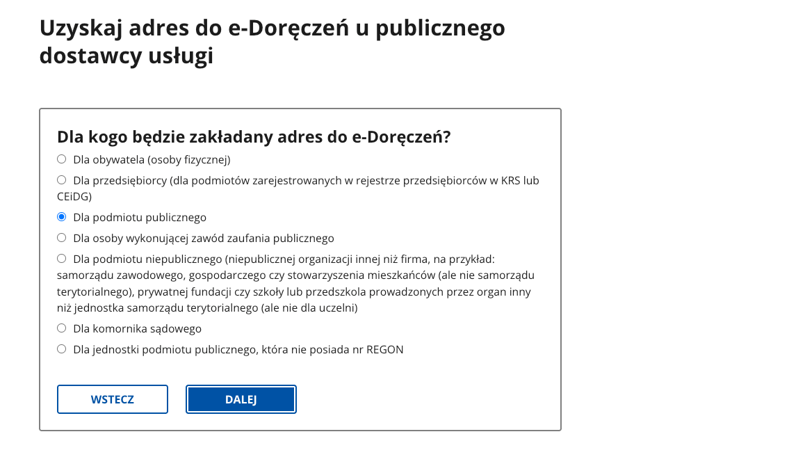
aria-errormessage, and the warning text is announced by screen readers thanks to aria-live="assertive".

7. Page title and page language

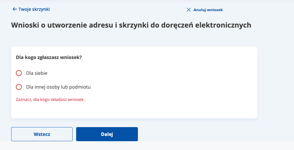
2.4.2 Title of page (A), 3.1.1 Language of page (A), 3.1.2 Language of part (AA)

Ocena: Niezgodne Rating: Non-compliant Ocena: Częściowo zgodne Rating: Partially compliant Ocena: Zgodne Rating: Compliant

Why is this important?

The title of the page informs users about the content and purpose of the page, as well as helps them to orient themselves when browsing multiple tabs. It is visible in the browser bar, in search results and in the history of visited pages. For people who use screen readers, the title is of particular importance – it is the first information they hear when they enter the site. The title also affects the positioning in search engines. It should be unique to each subpage and include key information such as the subpage name and site name.

The correct designation of the language of the page (lang attribute) allows screen readers to correctly read the content in the appropriate language and tone of voice.

The absence or mislabeling of the language makes it difficult to understand the content, especially on multilingual sites. Each page should have a primary language set, and fragments in other languages should have a local designation (lang="en”, lang="de”).

What we checked

  • Whether the subpages of the site have a title describing their purpose or topic.
  • <html lang="pl">Is the main document language set in the page code.

Findings

Page language

Each audited page correctly defines the document language.

Page title
e-Deliveries mailbox setup form

The reviewed subpages have precisely defined titles:
<title>Get an e-Deliveries address from a public service provider - Gov.pl - Gov.pl Portal</title>

8. Skip links

2.4.1 Bypass Blocks (A)

Ocena: Niezgodne Rating: Non-compliant Ocena: Częściowo zgodne Rating: Partially compliant Ocena: Zgodne Rating: Compliant

Why it matters

Skip links allow users to bypass repeated sections (such as the header or navigation menu) and jump directly to the main content. This significantly improves efficiency for people who navigate with a keyboard or use screen readers, as they move through the page sequentially.Without skip links, these users must press Tab many times to reach the main content, which slows navigation and increases effort.

What we checked

  • Whether the page includes a skip link at the top (e.g., “Skip to content”).
  • Whether the skip link is keyboard-accessible and becomes visible on focus.

Findings‍

Skip links are present and work correctly.

9. Reflow and responsiveness

1.3.4 Orientation (AA), 1.4.10 Reflow (AA), 1.4.4 Resize Text (AA)

Ocena: Niezgodne Rating: Non-compliant Ocena: Częściowo zgodne Rating: Partially compliant Ocena: Zgodne Rating: Compliant

Why it matters‍

A website that adapts to different screen sizes provides a comfortable experience on desktops, tablets, and smartphones. Users should not need to scroll horizontally or zoom in to read text or activate controls.

What we checked

  • Whether the page automatically adapts to window size and screen orientation (portrait/landscape) without losing content or functionality.
  • Whether no horizontal scrolling is required at a width of 320 px, except for elements that naturally require it (e.g., data tables, charts, toolbars).
  • Whether text can be resized up to 200% without loss of content or functionality – no clipping, overlapping, or loss of readability.
  • Whether interface elements (buttons, forms, menus) remain readable, accessible, and properly proportioned in mobile view.

Findings

All criteria are met.

Summary

Overall accessibility assessment

Rating: The website is accessible

The reviewed mObywatel views allow users to independently use key features with the keyboard and assistive technologies. Focus is consistently visible, the core user journey is predictable, and the e-Deliveries mailbox setup form is implemented in a mature way (semantics, grouping, validation, and messaging). The identified issues are isolated and do not block completion of the main process, but addressing them would improve interaction consistency and predictability.

What works well

  • Keyboard support – interactive elements are reachable and focus is clear and consistent across the reviewed views.
  • Skip links – work correctly and help users reach content faster.
  • e-Deliveries form – correct semantics (<form>, sections, <fieldset>/<legend>), native buttons, and a consistent field layout.
  • Error validation – clear and well communicated to assistive technologies (aria-invalid, aria-errormessage, aria-live).
  • Page titles and document language – correctly defined.
  • Reflow/responsiveness – no loss of content or functionality on narrow viewports or when zoomed.

© 2025 Effect-Driven Design. All rights reserved.