A11y Check: Quick accessibility audit of the mObywatel website – part 1
The mObywatel website is one of the most important public services for handling official matters online. As part of the “A11y Check” series, we evaluated its accessibility and how users relying on assistive technologies experience the service. This is the first part of a short audit showing how inclusive and user-friendly the platform really is.
14.1.2026
Date of audit
09-14.01.2026
Page/Project
https://www.mobywatel.gov.pl/
Tools used in the audit
Chrome browser, MacBook, WAVE, keyboard testing, VoiceOver screen reader, DOM tree inspection
Conducted by
Marta Słomka
Introduction
In this quick audit, we assessed the accessibility of the mObywatelwebsite – starting from entering the government portal, through the login process, the dashboard view, and finally completing a selected form. The analysed form concerned setting up an e-Delivery inbox, which from 1 January 2026 will become the primary method of online communication with public administration.
We analysed three key views:
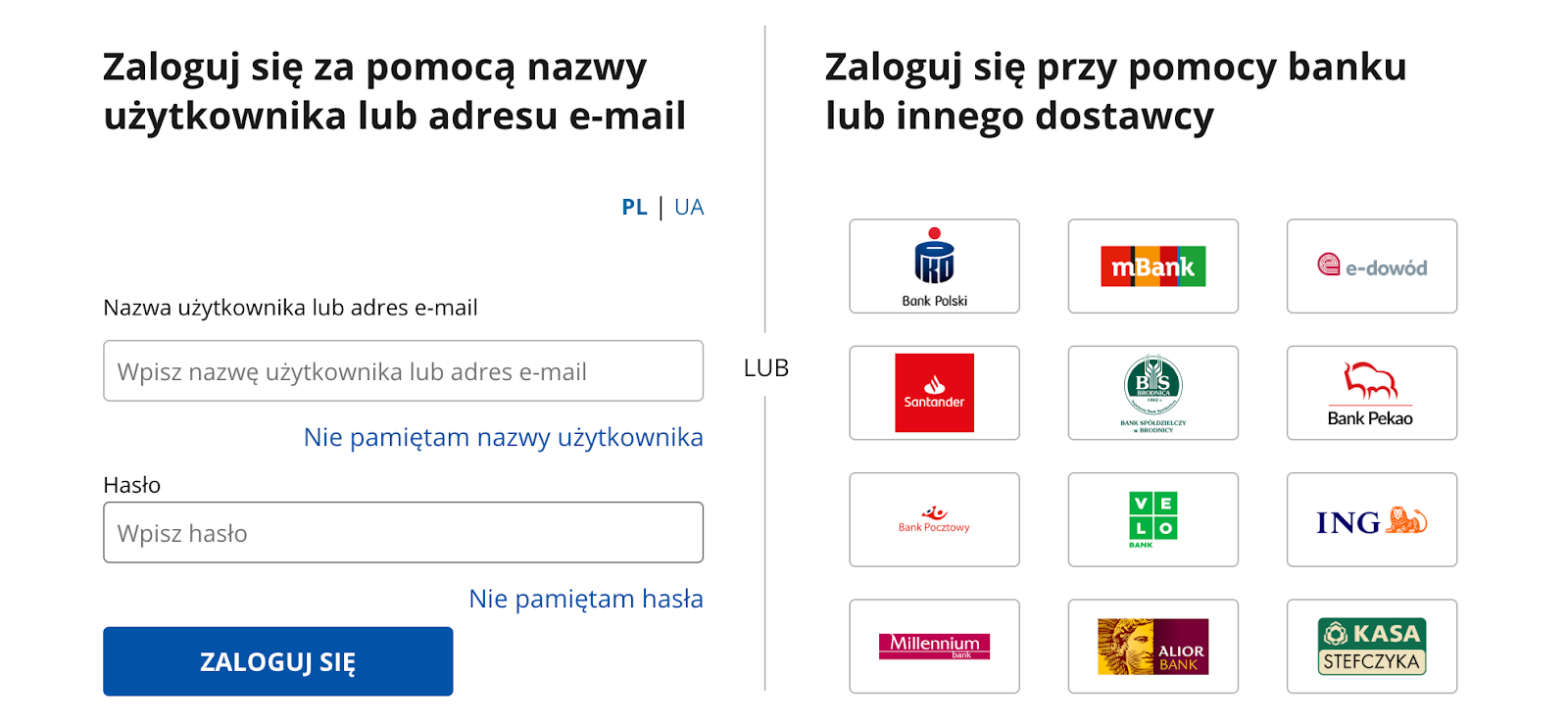
Path from the homepage to login– we verified whether the login entry point is easy to find and whether authentication method selection is clear. The tested path was a commonly used one – login via Trusted Profile. Why it matters: without successful login, users cannot access any services.
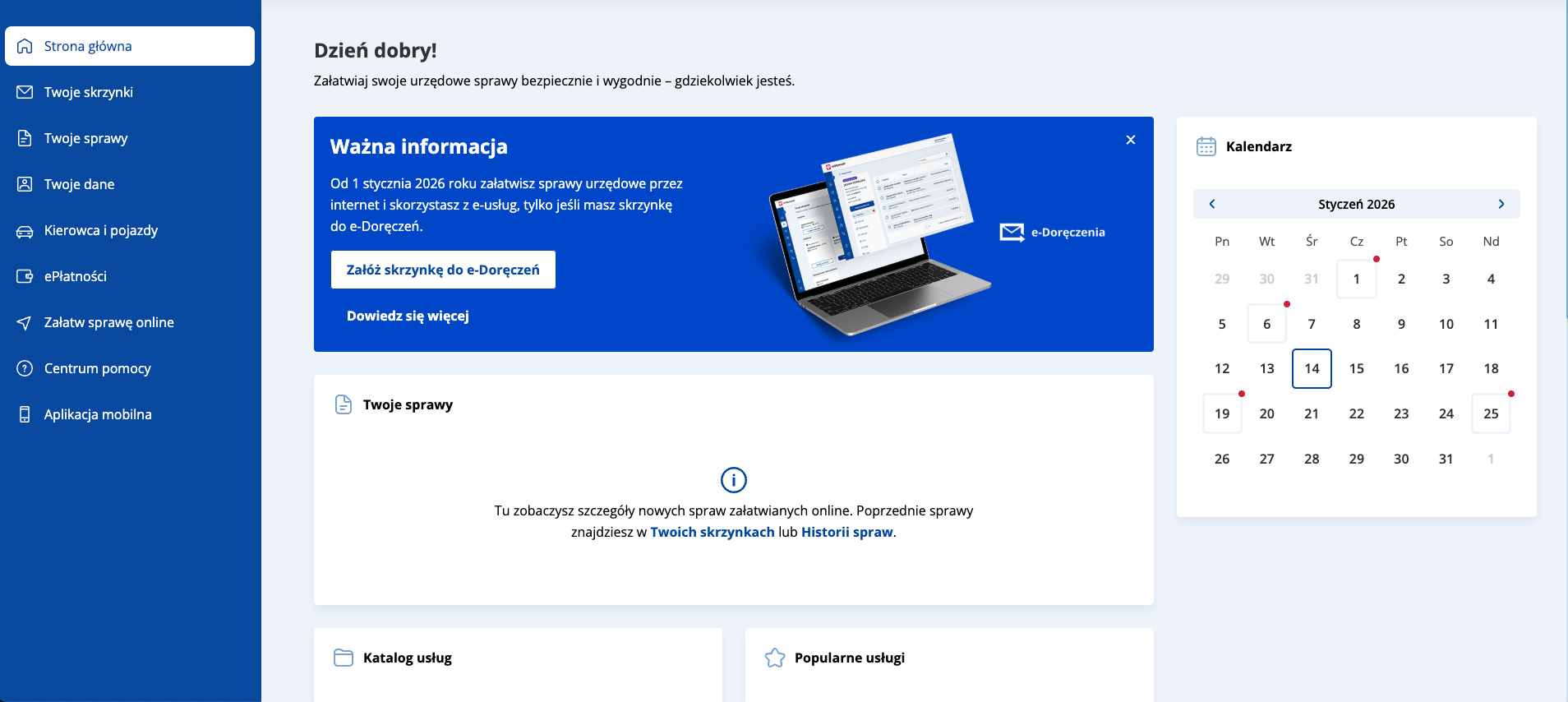
Dashboard after login – the first view after signing in. Users see available functions, documents, and services. Why it matters: clarity of this view determines whether users can quickly find needed options and understand the system’s capabilities.
e-Delivery inbox registration form – from 1 January 2026, many e-services will be available only after creating an e-Delivery inbox. Why it matters: as this is a primary communication channel with public authorities, the form must be fully accessible to all users.
Research context
The audit was conducted as part of a series of short reviews of websites and applications focused on digital accessibility. Its purpose is to assess the extent to which public-sector services comply with the key WCAG 2.1 AA criteria and the requirements of the Polish Digital Accessibility Act of 2019.
Audit method
The audit was carried out using the Accesscheck quick-assessment method, combining expert review with automated testing. The evaluation covers between 7 and 10 key criteria addressing the most common accessibility issues. The analysis includes up to three or four views – those most frequently used as entry points to the service.
The overall accessibility score is defined on a three-level scale:
Accessible – the website meets most WCAG 2.1 AA requirements. Any non-compliances are minor and do not significantly affect access to content.
Partially accessible – the website meets many requirements but contains notable issues in specific areas (e.g., navigation, forms, multimedia). These problems may limit accessibility for some users.
Not accessible – the website does not meet key WCAG 2.1 AA criteria. Structural, navigation, or interaction issues prevent some users from fully or at all accessing the content.
Note
A full accessibility audit requires evaluating the selected views against 50 success criteria of WCAG 2.1 at levels A and AA, or 55 success criteria of WCAG 2.2 at levels A and AA. The audit is conducted by a digital accessibility specialist with frontend development expertise, which enables precise and technically grounded recommendations for identified issues.
Accessibility audit – score based on chosen criteria
1. Alternative text for non-text content
1.1.1 Non-text content (A)
Ocena: NiezgodneRating: Non-compliantOcena: Częściowo zgodneRating: Partially compliantOcena: ZgodneRating: Compliant
Why it matters
Text alternatives (descriptions of images and other non-text content) allow all users to understand what appears on a page, including people who are blind or have low vision. They enable screen readers to describe the content of an image. They are also useful when an image fails to load because of an error or a weak internet connection. In addition, they help search engines index images by recognising their content and linking them to the topic of the page, which can improve visibility in search results.
A good text alternative should be short, simple, and explain what the image shows or what its purpose is. It should not repeat information already provided in nearby text. If an image is decorative and adds no meaning, it should be hidden from screen readers.
What we checked
Whether images, photos, charts, maps, infographics, and decorative graphics include correct text alternatives (alt attribute).
Whether graphic buttons and links have descriptions that clearly state their function or purpose.
Whether form fields are properly labelled so users know what information to enter.Whether CAPTCHA elements provide an alternative verification method (e.g., audio).
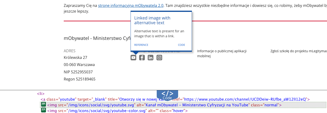
Social media logos used as links contain descriptive alt attributes, providing assistive technology users with clear information about link purpose (e.g. alt="mObywatel – Ministry of Digital Affairs YouTube channel").
Other images include appropriate alternative text or empty alt attributes for decorative graphics.
Decorative elements (icons) are hidden from screen readers (alt="" and aria-hidden="true"), preventing unnecessary announcements.
Trusted Profile login – the links with bank’s logotypes are correctly implemented – images use empty alt attributes, while each link includes visually hidden sr-only text giving it a clear accessible name, e.g. “Login via PKO BP”.
All non-text elements have properly defined alternative descriptions.
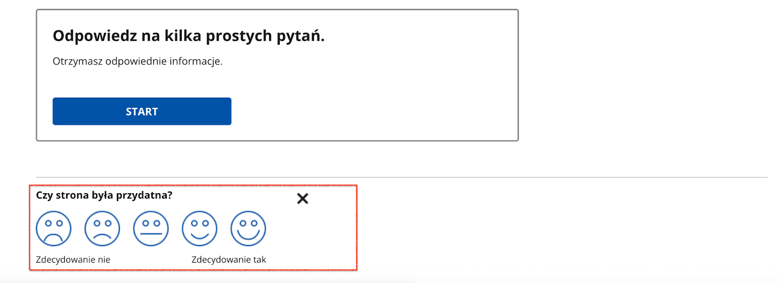
The image-based survey is accessible – each facial icon includes a detailed alternative description, explaining both satisfaction level and interaction result.
2. Heading structure
1.3.1 Info and relationships (A), 2.4.6 Headings and labels (AA)
Ocena: NiezgodneRating: Non-compliantOcena: Częściowo zgodneRating: Partially compliantOcena: ZgodneRating: Compliant
Why it matters
Headings organise content and help users quickly understand the structure of a page. They make it easier to find information and see how sections relate to each other.
They are also essential for accessibility – screen readers use headings to navigate, and users with dyslexia or older adults can follow the content more easily.
A clear heading hierarchy also supports search engine visibility.
What we checked
Whether headings on the page follow a logical and consistent hierarchy (H1–H6).
Findings
All tested pages follow a correct heading hierarchy except one case: on the pre-login homepage, two H1 headings appear:
“mObywatel”
“gov.pl – Official website of the Republic of Poland”
This structure disrupts logical content hierarchy and makes navigation harder for screen reader users.
3. Text contrast
1.4.3 Contrast (Minimum) (AA)
Ocena: NiezgodneRating: Non-compliantOcena: Częściowo zgodneRating: Partially compliantOcena: ZgodneRating: Compliant
Why it matters
Sufficient contrast between text and background makes content easier to read for all users, not only for those with visual impairments. Low contrast makes text difficult to read, especially in poor lighting or on lower-quality screens.
The contrast ratio defines the difference in luminance between text and its background. For normal text, it should be at least 4.5:1, and for large text and headings 3:1.
What we checked
Whether text and text-based graphics meet the minimum contrast ratio of 4.5:1.
For large text: 3:1.
Findings
Key components of the mObywatel design system meet contrast requirements. The identified issue concerns a secondary element and does not affect the main user journey.
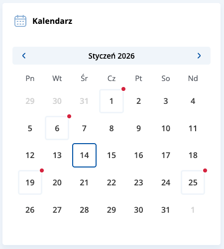
Calendar component – days displayed in grey have insufficient contrast (1.49:1), which may reduce readability for users with visual impairments.
4. Link clarity
2.4.4 Link Purpose (In Context) (A)
Ocena: NiezgodneRating: Non-compliantOcena: Częściowo zgodneRating: Partially compliantOcena: ZgodneRating: Compliant
Why it matters
Links must clearly communicate where they lead and what happens after activation. This helps users navigate the website and quickly find needed information.
For people using screen readers, link clarity is especially important – many of them hear only the link text, without surrounding context. Phrases such as “read more”, “click here”, or “see” are not descriptive enough.
Clear link text also improves SEO by helping search engines understand page structure and content.
What we checked
Whether link text clearly communicates the destination or action.
Whether links avoid vague phrases such as “read more”, “click here”, or “download” without added context.
Whether contextual descriptions are provided when links appear in lists or longer sentences.
Findings
Across all tested pages, the method of informing users about links opening in a new tab requires improvement. Currently, this information is mainly conveyed via the title attribute, which is not a reliable accessibility solution.
It is recommended to include this information in the accessible link name, e.g. using aria-label or visually hidden text (sr-only).
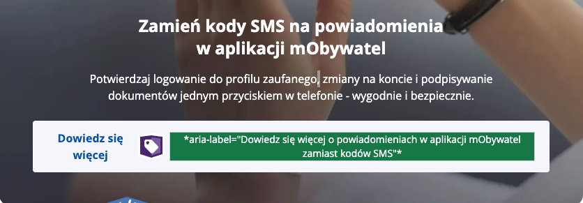
Information about the terms and conditions link opening in a new window is provided via aria-description. Although technically valid, this attribute may be ignored by some screen readers. Using aria-label or sr-only text is recommended.

