A11y Check: Quick accessibility audit of the Rzecznik Finansowy website – part 1

The website helps citizens get information and support in disputes with financial institutions such as banks, insurers, loan companies, and pension societies. It allows users to submit a request for intervention or mediation, learn about consumer rights in the financial market, and access assistance from Rzecznik Finansowy (Financial Ombudsman) specialists.

20.11.2025
Data audytu
07.10.2025 – 09.10.2025
Strona/projekt
https://rf.gov.pl/
Narzędzia użyte w audycie
Chrome browser, MacBook, WAVE, keyboard testing, VoiceOver screen reader, DOM tree inspection
Przeprowadzone przez
Marta Słomka

Introduction

In this quick audit, we reviewed the accessibility of the Rzecznik Finansowy’s (Financial Ombudsman’s) website. The publication is split into two parts and is part of our series of short audits of public websites and services.

The website helps citizens obtain information and support in disputes with financial institutions such as banks, insurers, loan companies, and pension societies. It allows users to submit a request for intervention or mediation, learn about consumer rights in the financial market, and access assistance from the Rzecznik Finansowy’s experts.

In this audit, we examine three key subpages that shape the user experience on this public portal:

  • Homepage – the starting point for most users, including consumers, journalists, and institutions. It contains main information sections, news, shortcuts to services, announcements about the Ombudsman’s activities, and a menu leading to key topic areas.
    Why it matters:
    the clarity and structure of the homepage determine whether users understand the site and can quickly find needed content.
  • For clients – Application templates– a section where users look for ready-made forms and documents needed to submit a request for intervention or mediation.
    Why it matters: this is where users take the first practical step toward resolving their issue.
  • Application for out-of-court dispute resolution – a subpage explaining how to submit a mediation request and providing the form for download or completion.
    Why it matters: this is the final stage of the user’s path when seeking help.

Research context

The audit was conducted as part of a series of short reviews of websites from different sectors, focused on digital accessibility. The goal is to assess how well public services meet basic WCAG 2.2 requirements and how prepared they are for the obligations of the European Accessibility Act (EAA).

Purpose and scope of the audit

The purpose of the audit is to quickly and preliminarily assess how the site meets the basic requirements of WCAG 2.1 and 2.2 at the A/AA level. The report shows the results of the review of several selected subpages and interface elements evaluated according to 10 criteria.

The scope of the audit is indicative and concerns the state of the website at the date of the audit.

Audit method

The audit was carried out using the Accesscheck quick-assessment method, combining expert review with automated testing. We evaluate 10 key criteria that cover the most common accessibility issues. The analysis includes up to three views – those most frequently used as entry points to the service.

The overall accessibility score is defined on a three-level scale:

  • Accessible – the website meets most WCAG 2.1/2.2 AA requirements. Any non-compliances are minor and do not significantly affect access to content.
  • Partially accessible – the website meets many requirements but contains notable issues in specific areas (e.g., navigation, forms, multimedia). These problems may limit accessibility for some users.
  • Not accessible – the website does not meet key WCAG 2.1/2.2 criteria. Structural, navigation, or interaction issues prevent some users from fully or at all accessing the content.

Note

A full accessibility audit requires evaluating the selected views against 50 success criteria of WCAG 2.1 at levels A and AA, or 55 success criteria of WCAG 2.2 at levels A and AA.

The audit is conducted by a digital accessibility specialist with frontend development expertise, which enables precise and technically grounded recommendations for identified issues.

Accessibility audit — score based on 10 criteria

1. Text alternatives for non-text content

1.1.1 Non-text Content

Assessment: Non-compliant Assessment: Partially compliant Assessment: Compliant

Why it matters

Text alternatives (descriptions of images and other non-text content) allow all users to understand what appears on a page, including people who are blind or have low vision. They enable screen readers to describe the content of an image.


They are also useful when an image fails to load because of an error or a weak internet connection. In addition, they help search engines index images by recognising their content and linking them to the topic of the page, which can improve visibility in search results.

A good text alternative should be short, simple, and explain what the image shows or what its purpose is. It should not repeat information already provided in nearby text. If an image is decorative and adds no meaning, it should be hidden from screen readers.

What we checked

  • Whether images, photos, charts, maps, infographics, and decorative graphics include correct text alternatives (alt attribute).
  • Whether graphic buttons and links have descriptions that clearly state their function or purpose.
  • Whether form fields are properly labelled so users know what information to enter.
    Whether CAPTCHA elements provide an alternative verification method (e.g., audio).

Findings

Issues:

  • Missing alt attributes on decorative graphics (e.g., Facebook, YouTube, BIP icons). A screen reader announces them as “link, graphic” without explaining where the link leads, leaving users unsure about the purpose of the element.
  • Missing alt attributes on some images in articles. Most images do have correct text alternatives, but in a few cases it is worth considering whether an alternative text is needed at all, as some images do not add meaningful information.

Positives:

  • Decorative icons use an empty alt attribute, so screen readers skip them.
  • Most images on the website have appropriate text alternatives.

2. Heading structure

1.3.1 Info and Relationships (A), 2.4.6 Headings and Labels (AA)

Assessment: Non-compliant Assessment: Partially compliant Assessment: Compliant

Why it matters

Headings organise content and help users quickly understand the structure of a page. They make it easier to find information and see how sections relate to each other.

They are also essential for accessibility – screen readers use headings to navigate, and users with dyslexia or older adults can follow the content more easily.

A clear heading hierarchy also supports search engine visibility.

What we checked

  • Whether headings on the page follow a logical and consistent hierarchy (H1–H6).

Findings

The heading structure on the reviewed subpages is correct.

3. Text contrast

1.4.3 Contrast (Minimum) (AA)

Assessment: Non-compliant Assessment: Partially compliant Assessment: Compliant

Why it matters

Sufficient contrast between text and background makes content easier to read for all users, not only for those with visual impairments. Low contrast makes text difficult to read, especially in poor lighting or on lower-quality screens.

The contrast ratio defines the difference in luminance between text and its background. For normal text, it should be at least 4.5:1, and for large text and headings 3:1.

What we checked

  • Whether text and text-based graphics meet the minimum contrast ratio of 4.5:1.
  • For large text: 3:1.

Findings

Issue:

  • On the reviewed pages, contrast is correct with one low-priority exception: in the top bar, the brand slogan “Twój sojusznik w świecie finansów” has a contrast ratio below the required level. The contrast can be increased using the provided contrast control.

Positives:

  • No significant contrast issues.
  • Built-in contrast control.

4. Contrast of graphic elements

1.4.11 Non-text Contrast (AA)

Assessment: Non-compliant Assessment: Partially compliant Assessment: Compliant

Why it matters

Graphic elements that serve a functional purpose – such as buttons, form field borders, icons, and charts – must be clearly distinguishable from the background and surrounding elements. Low contrast can make them hard or impossible to see for some users, preventing effective interaction with the interface. 

The required minimum contrast ratio is 3:1.

What we checked

  • Contrast of non-text elements such as buttons, field borders, icons, and the keyboard focus indicator.

Findings

Positives:

  • On the analysed pages, we did not identify issues with non-text contrast – all interface components are clearly visible and meet WCAG 2.2 AA requirements.

5. Link clarity

2.4.4 Link Purpose (In Context) (A)

Assessment: Non-compliant Assessment: Partially compliant Assessment: Compliant

Why it matters

Links must clearly communicate where they lead and what happens after activation. This helps users navigate the website and quickly find needed information.

For people using screen readers, link clarity is especially important – many of them hear only the link text, without surrounding context. Phrases such as “read more”, “click here”, or “see” are not descriptive enough.

Clear link text also improves SEO by helping search engines understand page structure and content.

What we checked

  • Whether link text clearly communicates the destination or action.
  • Whether links avoid vague phrases such as “read more”, “click here”, or “download” without added context.
  • Whether contextual descriptions are provided when links appear in lists or longer sentences.
  • Whether users are informed when a link opens in a new tab or window.

Findings

Homepage

Social media icon links

  • The image inside the link uses an empty alt attribute (alt="").
  • The title attribute (title) does not describe the link’s purpose – it only states that it opens in a new tab.
  • For screen reader users, the link is announced as “link, link opens in a new tab” with no name, so the destination is unclear.

Logo – link to the homepage

  • The logo has a descriptive alt="Rzecznik Finansowy", but it does not state the purpose – that it links to the homepage.
  • This could be clarified with an aria-label.

“Read more” buttons

  • These links are ambiguous – the destination is unknown.
  • They also repeat within lists, which confuses screen reader users.
  • Each “Read more” link must include a precise description of its target, for example:

    • aria-label="Read more: [article title]",
      or
    • a visually hidden label (<span class="sr-only">…article title…</span>).
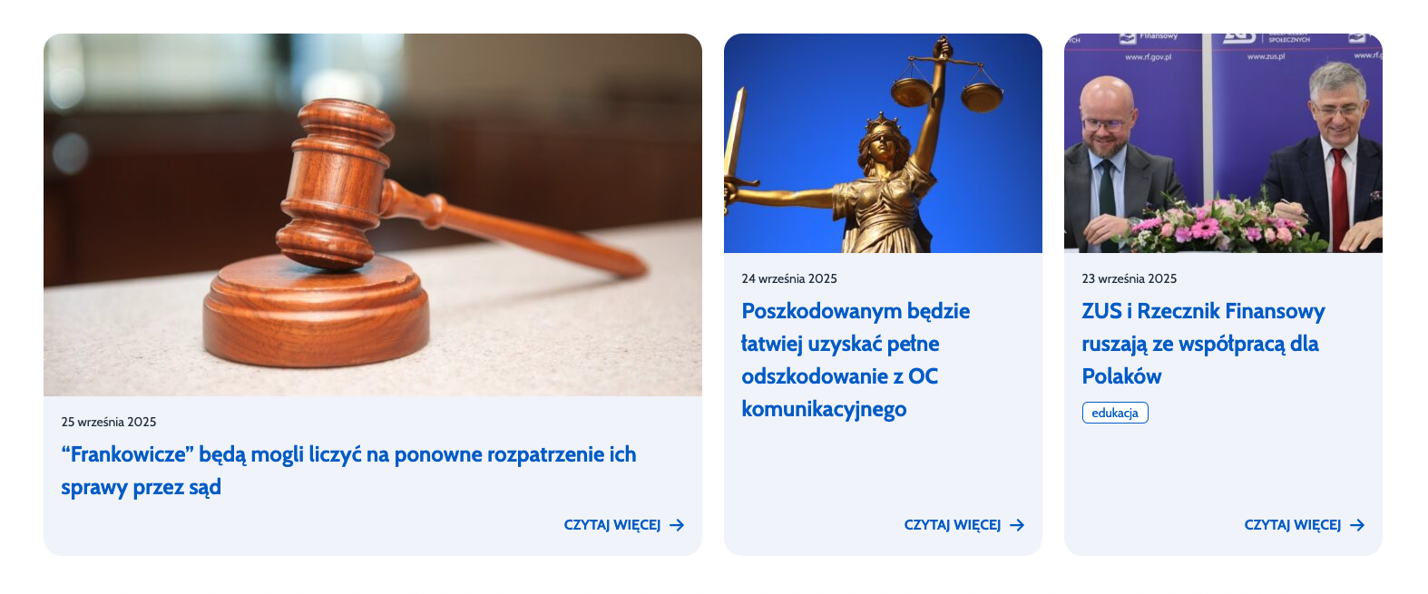
  • Tags linking to search results
    • Tags lead to a results page but are marked as <button> instead of <a>.
    • They should be links styled as buttons.
    • In the current form, screen readers announce them as buttons, suggesting an action on the current page (e.g., filtering), not navigation.
Subpage: “For clients – Application templates

Links to files (DOC, DOCX)

  • Screen readers announce the file name, format, and size, but miss the category context (e.g., “For applicants requesting intervention in insurance and pension matters”).
  • Users cannot understand what the template is for.
  • An aria-label should include the full description, for example:

    aria-label="Download the application template (DOCX, 0.03 MB) for applicants requesting intervention in insurance and pension matters".

ePUAP links in body text

  • The link uses only the visible word “Link” – not descriptive.
  • The information about opening in a new tab is only in the title attribute, which many screen readers ignore.
  • Instead of relying on title, use an aria-label or a visually hidden label (.sr-only) that clearly explains the purpose and informs about the new tab.
Subpage: Application page

Links to the instructional YouTube video in body text

  • The link text is not descriptive enough – the phrase “to the instructional video” does not indicate it links to YouTube or that it opens in a new tab.
  • The “new tab” information is only in the title attribute, which many screen readers do not read. Use an aria-label or a visually hidden label (.sr-only) to provide a clear and complete description of the link’s purpose.

© 2025 Effect-Driven Design. All rights reserved.