A11y Check: Quick accessibility audit of the Rzecznik Finansowy’s (Financial Ombudsman’s) website – part 2
The second part of our quick audit from the “A11y Check” series. The Rzecznik Finansowy’s (Financial Ombudsman’s) website helps citizens obtain information and support in disputes with financial institutions such as banks, insurers, loan companies, and pension societies.
2.12.2025
Date of audit
07-09.10.2025
Page/Project
https://rf.gov.pl/
Tools used in the audit
Chrome browser, MacBook, WAVE, keyboard testing, VoiceOver screen reader, DOM tree inspection
Conducted by
Marta Słomka
Introduction
In this second part of the quick accessibility audit of the Rzecznik Finansowy’s (Financial Ombudsman’s) website, we continue our assessment of the service. You can find the first part of the audit here: link.
The website helps citizens obtain information and support in disputes with financial institutions such as banks, insurers, loan companies, and pension societies. It allows users to submit a request for intervention or mediation, learn about consumer rights in the financial market, and access assistance from the Rzecznik Finansowy’s experts.
In this audit, we examine three key subpages that shape the user experience on this public portal:
Homepage – the starting point for most users, including consumers, journalists, and institutions. It contains main information sections, news, shortcuts to services, announcements about the Ombudsman’s activities, and a menu leading to key topic areas. Why it matters: the clarity and structure of the homepage determine whether users understand the site and can quickly find needed content.
“For clients – Application templates” – a section where users look for ready-made forms and documents needed to submit a request for intervention or mediation. Why it matters: this is where users take the first practical step toward resolving their issue.
“Application for out-of-court dispute resolution” – a subpage explaining how to submit a mediation request and providing the form for download or completion. Why it matters: this is the final stage of the user’s path when seeking help.
Research context
The audit was conducted as part of a series of short reviews of websites and applications focused on digital accessibility. Its purpose is to assess the extent to which public-sector services comply with the key WCAG 2.1 AA criteria and the requirements of the Polish Digital Accessibility Act of 2019.
Audit method
The audit was carried out using the Accesscheck quick-assessment method, combining expert review with automated testing. The evaluation covers between 7 and 10 key criteria addressing the most common accessibility issues. The analysis includes up to three or four views – those most frequently used as entry points to the service.
The overall accessibility score is defined on a three-level scale:
Accessible – the website meets most WCAG 2.1 AA requirements. Any non-compliances are minor and do not significantly affect access to content.
Partially accessible – the website meets many requirements but contains notable issues in specific areas (e.g., navigation, forms, multimedia). These problems may limit accessibility for some users.
Not accessible – the website does not meet key WCAG 2.1 AA criteria. Structural, navigation, or interaction issues prevent some users from fully or at all accessing the content.
Note
A full accessibility audit requires evaluating the selected views against 50 success criteria of WCAG 2.1 at levels A and AA, or 55 success criteria of WCAG 2.2 at levels A and AA. The audit is conducted by a digital accessibility specialist with frontend development expertise, which enables precise and technically grounded recommendations for identified issues.
Accessibility audit – score based on chosen criteria
Ocena: NiezgodneOcena: Częściowo zgodneOcena: Zgodne
Why it matters
Keyboard operability and visible focus are essential for users who do not use a mouse – whether due to personal preference, motor limitations, or visual impairments.
Every interactive element (link, button, form field) must be accessible using the keyboard, and the currently active element must be clearly indicated, typically with a visible outline or colour change. This ensures that users always know where they are on the page.
What we checked
Whether all links, buttons, and form fields can be operated using the keyboard alone.
Whether focus is always visible during navigation.
Whether the tab order is logical and consistent. Whether there are no keyboard traps that prevent users from moving away without using a mouse.
Findings
Overall, the Rzecznik Finansowy’s (Financial Ombudsman’s) website is partially keyboard-accessible – users can reach most elements, but not all of them behave according to expected interaction patterns.
Unfortunately, the application form for out-of-court dispute resolution contains elements that cannot be operated with the keyboard (e.g., some checkboxes). This makes the form impossible to complete.
Main navigation
After activating a menu item with a dropdown (using Enter), focus does not move to the first item in the expanded submenu.
The submenu does not support arrow-key navigation – instead of moving between items, the background page scrolls.
Application form
Tab navigation skips some fields, especially checkboxes, making them impossible to select without using a mouse.
7. Form handling
1.3.1 Info and Relationships (A), 3.3.2 Labels or Instructions (A), 4.1.2 Name, Role, Value (A)
Ocena: NiezgodneOcena: Częściowo zgodneOcena: Zgodne
Why it matters
Form field labels help users understand what information should be entered in each field. They make forms easier and more intuitive to complete.
They are especially important for people using screen readers – these technologies read labels aloud, informing users what type of data is required. Without labels, blind or low-vision users cannot complete a form independently.
Labels should always remain visible, regardless of screen resolution or the content entered in the field.
What we checked
Whether form fields have correctly associated labels (<label> or ARIA attributes).
Whether screen readers correctly interpret the form structure and relationships between elements.
Whether each field has a clear and unambiguous label or instruction.
Whether labels remain visible at all times.
Whether required fields are properly marked (required, aria-required).
Whether field grouping uses <fieldset> and <legend> where appropriate.
Whether interactive elements have a defined name, role, and value through semantic HTML or ARIA.
Whether dynamic components (e.g., messages, dialogs, tabs) are accessible to screen readers.
Whether the current state of elements (e.g., expanded, active, hidden) is correctly conveyed to assistive technology.
Findings
Most form fields have correct <label> associations and use aria-required="true", which communicates required status to assistive technologies. However, we identified several issues and inconsistencies in the form structure.
Identified issues
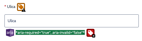
Labels – Some fields (e.g., Ulica) do not have a correctly associated label (for and id), which makes them harder to identify for screen readers.
Single-choice questions
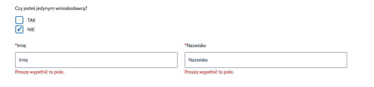
For mutually exclusive answers (YES/NO), checkboxes are incorrectly used – according to accessibility best practices, these should be radio buttons.
Semantic grouping of questions and answers is missing – <fieldset> and <legend> should be used so that screen readers can correctly understand the question context.
Error handling
Error messages are not accessible to screen readers —– they are marked with aria-hidden="true" and therefore not read.
Messages are too generic (e.g., “Please fill in this field”) and do not specify which field they refer to. We recommend messages such as “Fill in the street field” or “Enter the house number”.
aria-describedby is not used to link each error message to the relevant field.
Sections that appear or disappear (e.g., Dane drugiego wnioskodawcy, which shows after selecting Nie) do not have correct ARIA communication:
Controls do not convey expanded state (aria-expanded, aria-controls).
Hidden fields are not marked with hidden or aria-hidden. As a result, screen readers are not informed that content has changed, leading to loss of context and making the form unusable.
Minor issues
The asterisk indicating required fields can be hidden from screen readers (aria-hidden="true") because required status is already communicated in the code.
Placeholders duplicate label text and add no extra value – they can be removed.
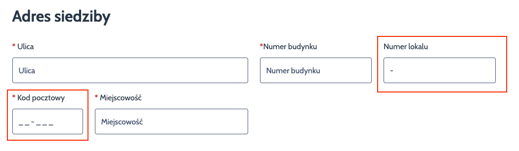
Input masks intended to hint at format may be read by screen readers as “underscore underscore dash underscore underscore underscore”, which is inconvenient.
Inaccessible file upload component
The file upload control is not accessible – the “Wgraj pliki z dysku” element is implemented as a link (<a href="#">) instead of a proper file input (<input type="file">).
Screen reader and keyboard users cannot independently upload a file and receive no information about the action’s purpose.
The component does not convey context (e.g., allowed formats or file limits), making it unreadable for assistive technologies.
8. Page title and page language
2.4.2 Page Titled (A), 3.1.1 Language of Page (A), 3.1.2 Language of Parts (AA)
Ocena: NiezgodneOcena: Częściowo zgodneOcena: Zgodne
Why it matters
The page title informs users about the content and purpose of the page and helps them navigate when multiple tabs are open. It appears in the browser tab, search results, and browsing history. For screen reader users, the title is especially important – it is the first information announced after the page loads. A good title should be unique for each subpage and include key information such as the page name and the service name. It also supports search engine optimisation.
Correct language declaration (lang attribute) allows screen readers to read the content in the proper language and with the correct pronunciation. Wrong or missing language settings make the content harder to understand, especially on multilingual websites.
Each page should have its main language defined, and any foreign-language fragments should be marked locally (e.g., lang="en", lang="de").
What we checked
Whether subpages have titles that describe their purpose or topic.
Whether the main document language is set (<html lang="pl">).
Whether foreign-language fragments use local language attributes (e.g., lang="en", lang="de").
Findings
The reviewed subpages have correctly defined titles that clearly describe their content, for example:
Each audited page has the correct document language defined – Polish in the main version and Ukrainian after switching languages. No content fragments were found in a language different from the main page language.
9. Skip links
2.4.1 Bypass Blocks (A)
Ocena: NiezgodneOcena: Częściowo zgodneOcena: Zgodne
Why it matters
Skip links allow users to bypass repeated sections (such as the header or navigation menu) and jump directly to the main content. This significantly improves efficiency for people who navigate with a keyboard or use screen readers, as they move through the page sequentially.Without skip links, these users must press Tab many times to reach the main content, which slows navigation and increases effort.
What we checked
Whether the page includes a skip link at the top (e.g., “Skip to content”).
Whether the skip link is keyboard-accessible and becomes visible on focus.
Findings
Skip links are present and work correctly.
10. Reflow and responsiveness
1.3.4 Orientation (AA), 1.4.10 Reflow (AA), 1.4.4 Resize Text (AA)
Ocena: NiezgodneOcena: Częściowo zgodneOcena: Zgodne
Why it matters
A website that adapts to different screen sizes provides a comfortable experience on desktops, tablets, and smartphones. Users should not need to scroll horizontally or zoom in to read text or activate controls.
What we checked
Whether the page automatically adapts to window size and screen orientation (portrait/landscape) without losing content or functionality.
Whether no horizontal scrolling is required at a width of 320 px, except for elements that naturally require it (e.g., data tables, charts, toolbars).
Whether text can be resized up to 200% without loss of content or functionality – no clipping, overlapping, or loss of readability.
Whether interface elements (buttons, forms, menus) remain readable, accessible, and properly proportioned in mobile view.
Findings
All criteria are met.
Summary
Overall accessibility assessment
Assessment: The website is partially accessible
The Rzecznik Finansowy’s (Financial Ombudsman’s) website has significant accessibility issues – most importantly, it cannot be fully operated using the keyboard, the forms are difficult or in some cases impossible to complete without a mouse, and many links do not clearly communicate their purpose or destination.Static elements perform better (headings, titles, language, contrast, responsiveness), but they do not compensate for the critical issues in key areas. As a result, in the reviewed views, the service does not meet important accessibility requirements and requires priority fixes.
What works well
The heading structure is logical and well-organised, making the content easy to read and navigate.
Page titles and language are correctly defined – the site supports both the Polish and Ukrainian versions.
Text contrast and interface element contrast are mostly correct.
The website adapts well to different devices – it works properly on desktops and mobile, and content remains intact when zoomed in.
Key issues to fix
Keyboard operability and focus visibility
The website cannot be fully operated using the keyboard – some elements (e.g., checkboxes) are skipped and cannot be activated.
Forms
Incorrect field types are used in several places (e.g., YES/NO questions implemented as checkboxes instead of radio buttons).
Error messages are not read by screen readers, and some labels are not correctly associated with their fields.
Links
Many links do not indicate their destination (“Read more”, “Link”).
Tags in the news section behave like buttons instead of proper links.
Expandable sections
Fields that appear after selecting an option (e.g., Dane drugiego wnioskodawcy) do not convey this change to screen readers, so users are unaware new content has appeared.
File upload
The “Upload files from your disk” control does not behave like a standard file upload element.
There is no information about allowed file formats or the number of files, which makes the feature unclear for users.


